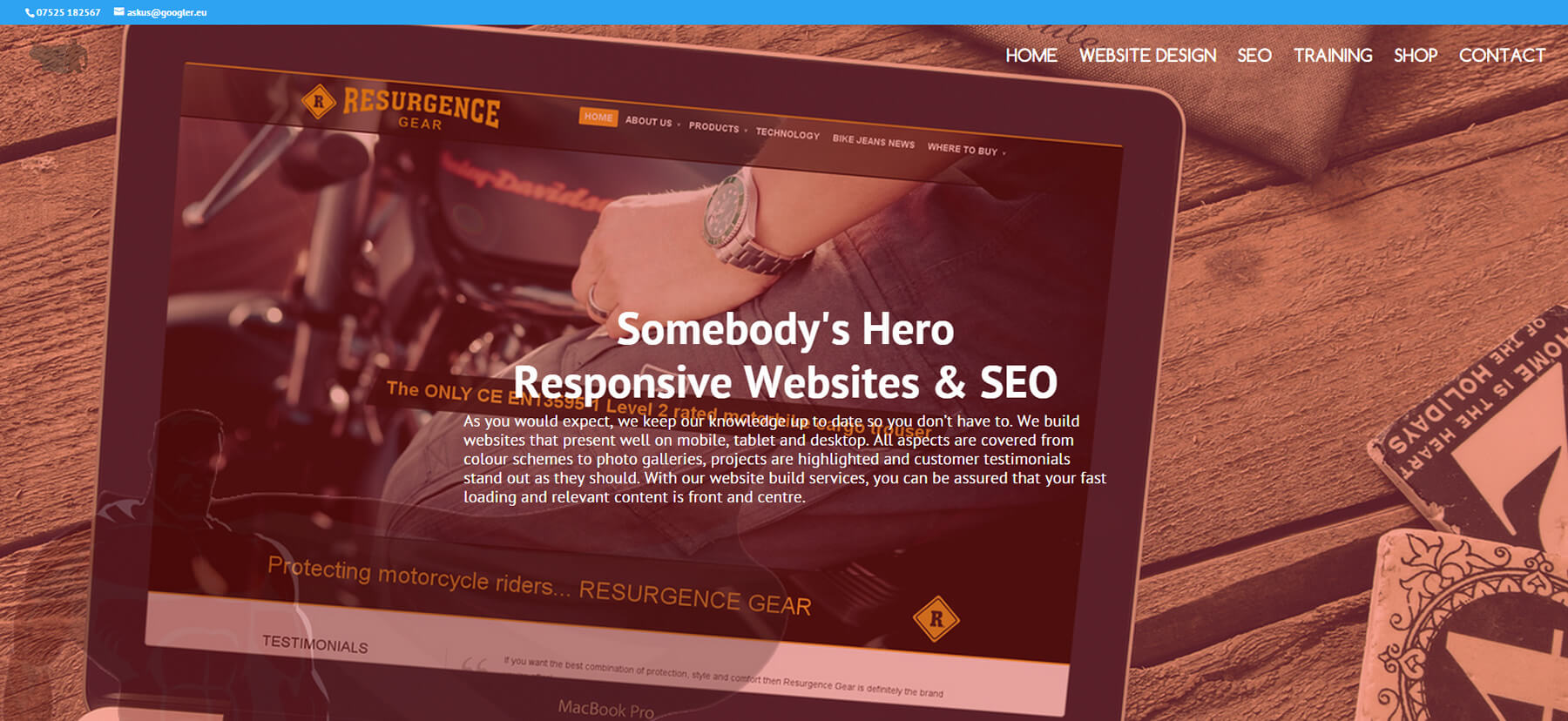
So, how do you create a non shrinking transparent menu in Divi?
I produced this video as I kept seeing this question as the new customiser in Divi can occasionally be difficult to navigate – and…we all have trouble reading the manual don’t we….Divi has this sometimes annoying thing that makes the logo shrink when the user scrolls – this is probably done for a good user experience so in most cases its good – we don’t want our content overtaken by our logo do we?
Without further ado, I recommend you click play and learn how I make the logo and the text in the menu stay the same size – of course, this does not apply to mobile rendering.
Enjoy and feel free to ask for more tutorials on anything you like in the comments below. If you have not already joined our Facebook Community that is approaching nearly 7,000 members – please click here to get free advice and a helping hand.


