There’s a lot of murmuring in the design community these days regarding carousel-style homepage sliders and the general idea that, well, they suck. Reasons cited: They’re bad for SEO, they work poorly on mobile, people glaze over them like they’re not there, they’re just plain evil. And yet, sliders are everywhere — they’re a standard part of the web design vocabulary in 2015. Clients love them, because it makes them feel like they can get more stuff at the top of the screen. But should we, the design community, be encouraging them?
In my personal experience, people really have developed the same sort of blindness to sliders that they have for banner ads. When I launched my homepage, I had a slider with three offers at the top of the page. Ninety percent of the comments I got back were roughly along the lines of “Why don’t you have X or Y on your homepage?” And overwhelmingly, most people didn’t even realize there was a slider — they just thought it was an image. In every way, it was a fail. I redesigned the page and created a grid of images related to my target audience with a tagline nested in the middle. The response has been overwhelmingly positive, ever since.
So what can you do with your homepage, “above the fold,” instead? (And yes, we can discuss the fact that “above the fold” doesn’t exist anymore in another post. Promise.) I’ve got 10 ideas here to inspire you.
1. A Hero Image (Just One)
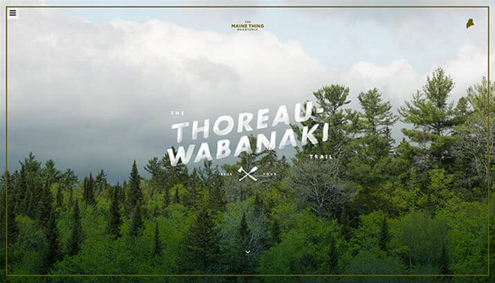
Custom photography is all the rage these days, and using a bold homepage image can still be incredibly effective as a strong visual hook (especially if your audience includes visual types like myself). So if you’re willing to invest in good photography — or have an exceptional talent for hunting down amazing stock images that are unique and not overused by everyone else on the planet — don’t feel like you have to abandon hero images entirely.
This homepage design by The Maine Thing Quarterly uses a full-screen hero image with trendy iconography and font choices to convey a tone and mood before you ever start reading. There are definitely those who feel like a full-page image is a dreadful waste of real estate, and you should really consider context, your audience and their general druthers before you go this route. But personally, I am still a huge fan of this look.
2. Your Smiling Face
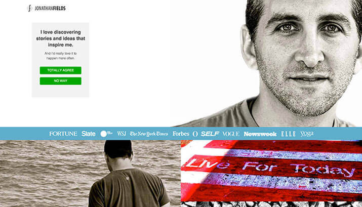
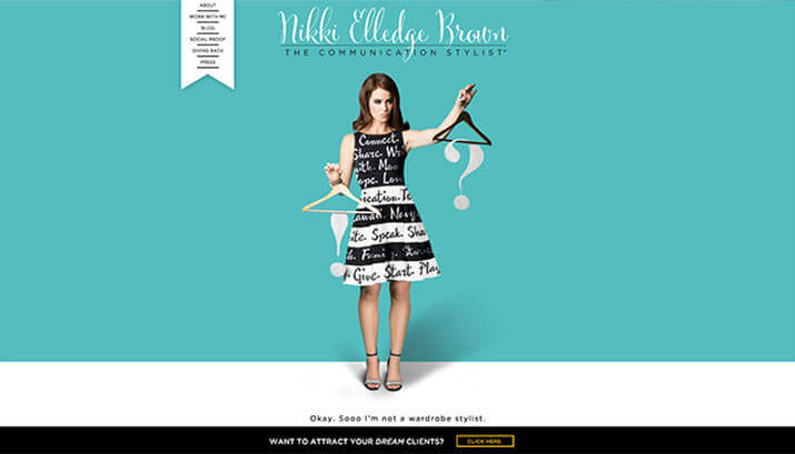
Especially for thought leaders, coaches and others of that ilk, putting your portrait front and center can be incredibly effective. It allows your users to connect with you instantly, and it gets them into your overall “vibe” without saying a word. You see this everywhere in the coaching and teaching sectors of the Web, so it’s not exactly the most original idea out there, but it can be done in ways that really stand out. Strong photography is a must if you want to use this style — so hire a professional photographer, and be strategic about planning a shoot that communicates your brand values in a clear way.
Jonathan Fields has done a great job with this on his site — his homepage image is bold and captivating, and it works really nicely in the overall design.
Nikki Elledge Brown also has a unique take on this approach, using a flat, colorful background and an ample number of props to communicate her brand.
3. Your Product
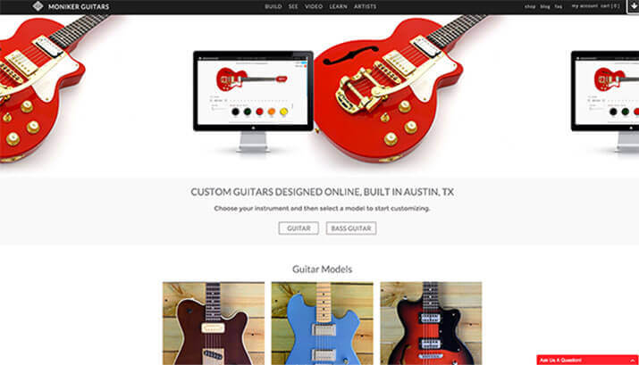
If you’ve got something to sell, why not skip straight to the punch? The Moniker Guitars site features not just their product but their process right there at the top of the homepage. They then lead you directly into that process immediately below — there’s not a lot of hunting involved in figuring out how to make this site work.
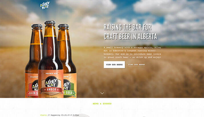
This site for Alley Kat Brewing Co. gives the hero image space over to its product.
4. Your Social Presence
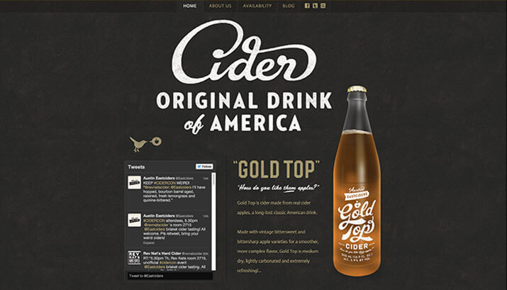
I love the way Austin Eastciders puts their Twitter feed front and center (okay, technically it is to the left) on their homepage. The way it’s fully integrated into the design is unique, and it encourages their fans to engage, knowing they’ll be featured prominently if they do.
5. Video
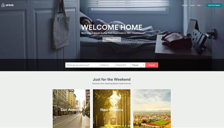
Video is another huge trend for 2015, and done well it can be really interesting. My favorite so far is on the Airbnb site — it plays through a loop of what seems like about 50 short videos on the top half of the homepage. For me (an admitted Airbnb junkie), the video adds a whole new layer of wanderlust in terms of cities and spaces one might visit.
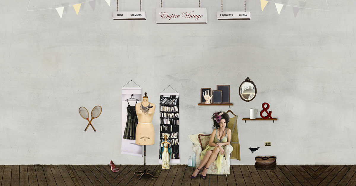
6. A Tableau
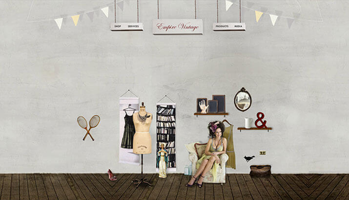
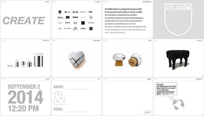
This site for Empire Vintage harkens back to the pre-CMS days of the web, when the goal was for every site to be an individual work of art. The effect is adorable, and it really stands out as unusual compared to today’s blocky, minimal designs.
7. Giant Text
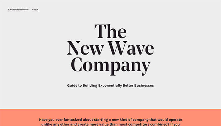
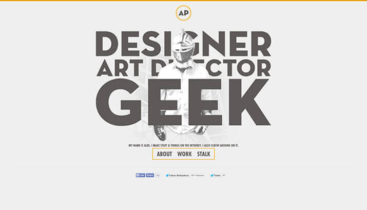
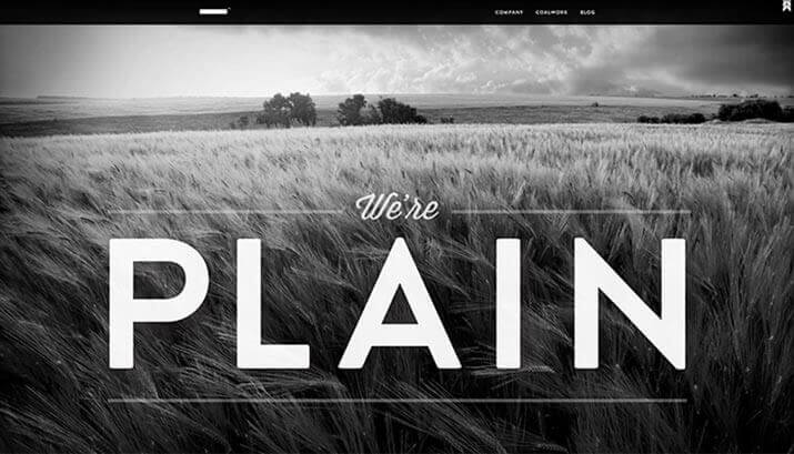
If you haven’t noticed this trend yet, you will — it will be everywhere in 2015. It can be hard to communicate the same amount of information with a few words as opposed to a strong image — you lose a lot of the subtle context. But I love the stark minimalism of a bold headline and nothing more. Designs that combine images with giant text will be the trend to watch. Overall, I’m interested to see where this one will go in the coming year.
8. Your Sign-up Form
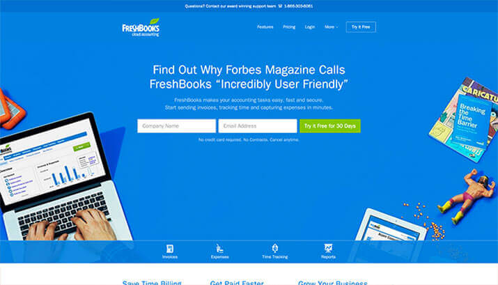
If conversion is the top goal for your site, there’s no reason to make your customers hunt for the goods. Especially for companies that offer SAAS (Software as a Service) products, signup — often for a free trial — is usually the big goal. I am especially fond of the way FreshBooks does this — I’m not sure if it’s the bold blue background or the Macho Man Randy Savage action figure, but this layout really stands out.
9. Signature Branding
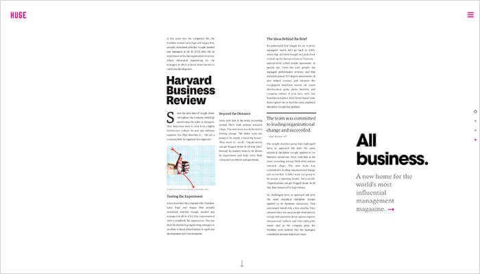
If your brand has evolved to the point that you’re experimenting with visual presentation, that can be a really fun thing to play up on the homepage. This design for digital agency Huge introduces their client work through interesting presentations of the letter H.
10. A Grid
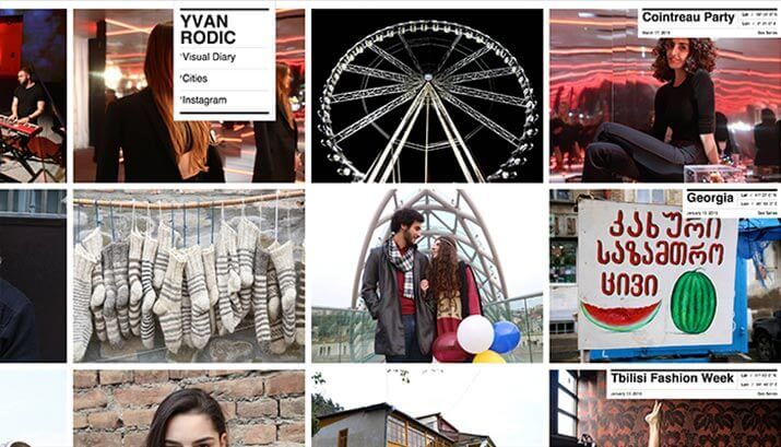
This is a really underutilized layout, in my opinion. It could work with a blog, with ecommerce, with a portfolio… with images and text combined, or just with images. I’d love to see more designers trying out unusual grid-based layouts.
If you aren’t ready to give up your sliders just yet, don’t worry — it took me a couple hours to find just 15 examples of alternatives that are standouts. Companies both large and small are still invested in their sliders, and this trend may not fully turn over until a whole generation of websites is ready for a good redesign.
But if you want to be a little more forward-thinking — anticipate that sliders are probably on the way out. And at the very least, there are a lot of other fun options you can play with that can make your designs really shine.



Thanks for sharing your ideas. I still have sliders on a couple of my sites and I have stumbled on more than one article stating they are bad. Yet, I haven’t pulled myself together to remove them, but that’s probably just a matter of time.
I still haven’t found out why they are bad for SEO, but I guess speed might hold part of the answer here.
Of the ideas you mention, I think I like “Your Smiling Face” the most. The sign up form can probably be very effective too and I have seen that on some very nice sites.
Enjoyed your article.
Great article and I can’t wait to try a lot of these ideas. For the Giant Text feature do you just use a full width slider in Divi using one image? What’s the best module to achieve this effect?
I have done it two ways – and one is definitely my preference, because I don’t love some of the quirks of the Divi slider. Most recently, I just used a text module with a background image applied – this way, you can style the text with CSS directly in the module if you want to. Easy peasy. I’ve also done it with the slider – I created some custom CSS in the control panel that enlarged the main slider text, then moved it around within the frame of the slider since the size changed… all around, I think this is the harder way to go with it. It also messes up the responsiveness of the slider, which is already a little quirky. Either way, you will have to fine-tune your text for every mobile viewport – there’s no way to avoid it when you’re using such enormous text, I don’t think – but I’d say the first way is easier!
Sliders for the sake of a slider may not be the best alternative.
But sliders definitely have their place especially in the travel industry where people want beauty shots of what they can expect front and center….
i actually agree. there are a few places where i still love to use sliders. my personal rule is – i just don’t ever want them to actually be necessary for communicating information. i don’t trust them for that anymore. but i love sliders for hotel sites and restaurant sites, in particular – where you want to have big, glossy eye candy. i like being able to see multiple shots in both those cases. and in those industries, there’s usually custom, professional photography, so it works.
Tami – wonderful post with some great examples. This will be on our discussion list at our next internal design meeting. I really appreciate the examples too – it helps dramatically to be able to see what is being discussed.
Awesome! The examples are the funnest part for me… I love looking at great websites. 🙂
Really nice article, Tami! Gave me lots MORE to think about…
Whooohoooo! Then I did my job. Thanks 🙂
I really liked the insights in this post and I have to admit I haven’t really thought about the alternatives to a big image or an image on the side and some text next to it so far. 🙂
P.S.: The font in the text area is different compared to the font in the text fields (where you enter your name, e-mail and website). This is a standard Divi “bug” (I can’t imagine ANYONE would prefer to have it this way) and I recommend “aligning” all the fonts that are being used on the page. 😉
Experiment, Oliver! That’s 99% of the fun!
And I’ll pass your comments on to the EM staff 😉 LOL. I’m just here to write! 😀
Love the article and I couldn’t agree more. I’m beginning to wonder just how effective they really are. Thanks for the article.
Not very, Patti! Thanks!
These are great!! I love people that think outside the box with their style, a desire to really standout and be bold sets the stage in such a big way. Thanks for sharing!
You’re welcome, Libby!
Tami, so excited to read the first of hopefully many blog postings here and elsewhere. I am so in love with GRIDS! I just installed UberGrid and having a blast with it!
It’s perfect for both my punk photo sites (jennylens.com and punkpioneers.com. Both are undergoing revisions. I only mention so you can check them out).
How do I convey the vast wealth of various info in my sites? Use my own punk photos or just a colorful array of blocks with topics. I replicate some menu info, but in a way which is far more accessible.
Many use Essential Grid, but I went with UberGrid and loving it! Easy peasy. I didn’t see a grid used anywhere else. I literally drew it and then looked for a plugin to use.
(Actually, I used an early grid type layout with Rocket Themes several yrs ago. Really hard to use compared to grid plugs today. Difficult back end, difficult to control layout and confusing for users. So this idea has been around for awhile, but recently made easier for developers and end users.)
I dislike hero images intensely. I’ve no patience for a pretty photo which has nothing to do with the side. If I see one more photo of a laptop or computer or coffee cup… well, it just makes me wanna leave the site.
Unless one is a photographer, posting a photo is not being a hero. IMHO.
Sliders can slow ya down too. Grids are fast loading! And again, they help ppl SEE what you are offering.
I see tons of coaches using professional head shots or portraits. That’s vital: seeing the real person behind the site.
Ok, LOVE your post and looking forward to more. Go Tami Go. You rock, my friend!
Thanks, Jenny! I love the idea of a grid for displaying your stuff – I think that’s the perfect idea for you. I will have to check UberGrid out – I just started a site this week using Essential Grid 🙂 More to come soon!
Great job Tami! I really like your ideas and may be trying some of them with next projects. keep’em coming!
Thanks, El – come back and share what you come up with! 😉
I’m already planning my next couple posts, so definitely more to come!
Great article Tami! As I have been wrestling with this issue, this article has really given me some options and ideas to ponder. A huge help!
Awesome! I’m glad I could help, Anthony!
Forward-thinking… That sums it up nicely. You make a good argument, and provide terrific examples of engaging alternatives, for rethinking the overused Homepage “hero” slider.
Thanks, Kathy! 🙂
Great blog!
Thanks, Suzan!
Great article Tami. My latest site I decided against the slider. I’m thinking of a hero image, but since reading this I a seriously excited by the possibilities of the grid. Also love th giant text, but won’t work with this one … I’ve always been curious about the conversion rates on the straight up front, don’t see anything else until you sign up home page, not a fan myself, but maybe it depends on your product?
Go grid!!! I would have to guess that the form thing, like anything else, depends on presentation. I looked at a ton of SAAS sites when I was looking for examples, and there are TONS (the majority) of sites that have really bland homepages that would not inspire me to sign up for much of anything unless I had come already convinced to convert…
Great to see alternative ideas. Thanks. I was hoping for more info on what’s WRONG with sliders and why/how these ideas are better. My understanding is that in addition to being ignored (as you point out) sliders are not good for Google-juice. Many of these alternatives, that are visually appealing, seem like they’d also not help SEO.
Sheila – if you check out the links in the first paragraph, they all branch out to articles that have a little more info on that. The first one, from Search Engine Land, is really good.
I really enjoyed your article Tami. I’m not a fan of sliders personally. My favorite is #2 – Your Smiling Face. Thank you for such a helpful post. I am sharing it with my friends and colleagues.
Thanks, Mike! Glad you enjoyed it.
A very well thought out & informative article Tami,and you are spot on with your observation that being different works!
Far too many websites look like clones of each other these days, with the obligatory Slider at the top on the Home page. That’s the visitors 1st point of contact/impression of the website, so it should be eye catching & draw the visitor into the site & take them on a journey. Sliders just don’t do that.
Thanks, Colin! Writing this got me thinking about the “above the fold” area quite a bit – because all the recent studies seem to be saying that’s no longer a thing. But I can’t help but feel, like you, that obviously what’s at the top of the page still matters quite a bit, as it’s your first impression of the site…
Hi Tami
Good ideas and great examples to illustrate the alternatives.
Not sure if I have a favourite but I’ve always liked giant text and good looking background images.
Thanks, Keith! I think giant text is probably my favorite at the moment – I’ve been playing around with it in my latest designs.