Spotlight: Gill Maheu | Photographer Portfolio Site
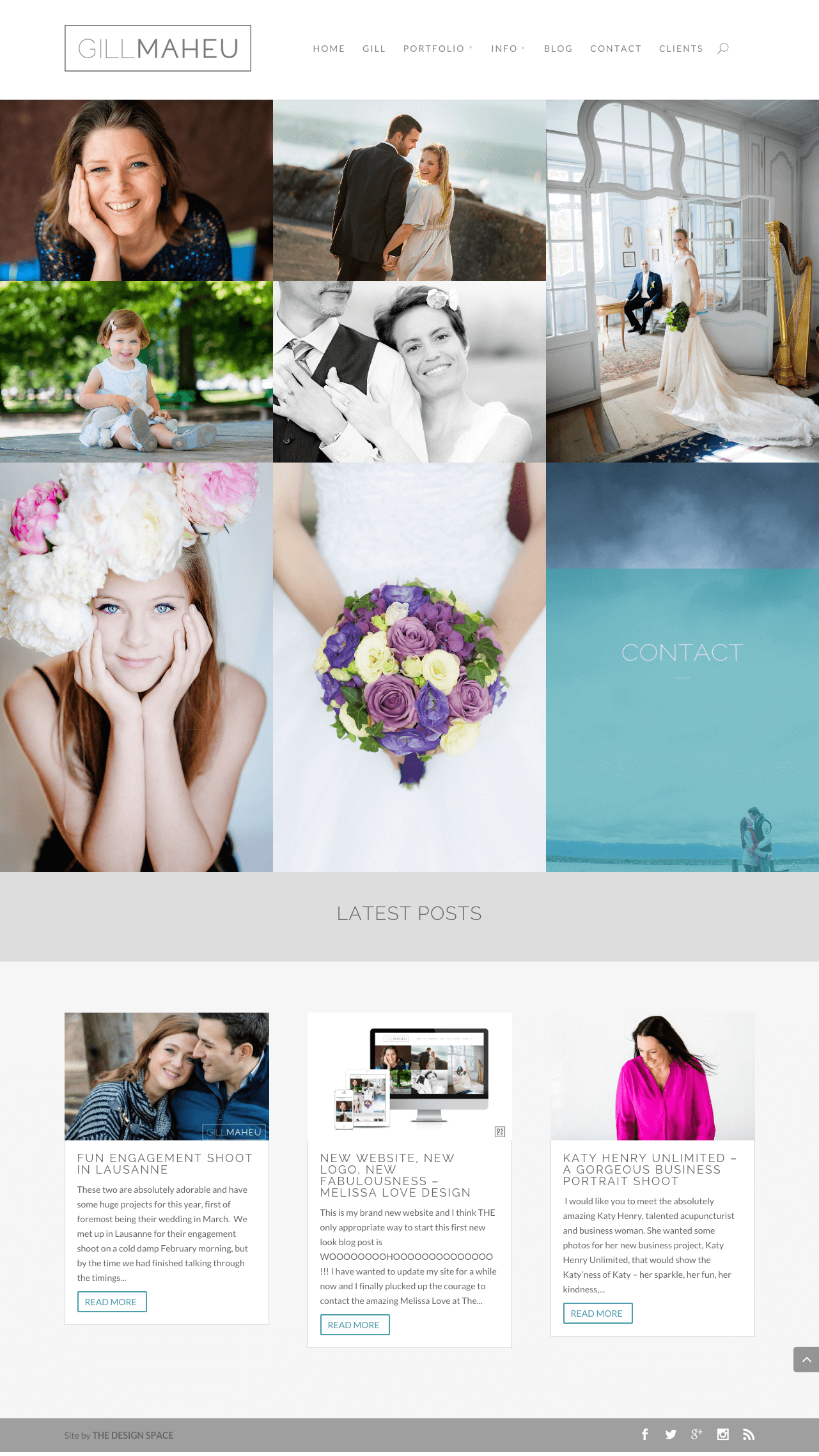
This photography portfolio is another great Divi site built by Melissa Love, the talented designer behind and number of inspiring Divi sites and the owner of The Design Space.
Like all of Melissas other designs, this website offers great inspiration as to what is possible with and mixture of Divi, hard work and talent. A clean, classy and creative way to showcase the photographers work and business information.

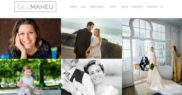
A good example of Keep It Simple, Stupid, this website creates an enticing look and feel that focuses on showcasing the photography and keeping the rest of the content accessible yet sitting quietly in the back seat. Let the great photography speak for itself and that alone will make people look further for more information and contact details.
Subtle design elements like:
- the drop-caps
- font selection
- custom read more buttons
- toggle animation
adds the finishing touches without overloading the user with unnecessary bells and whistles.
The site extends the basic Divi functionality for displaying images with the essential grid plug-in which allows you to create a seemingly infinite number of grid layouts that is ideal for any portfolio, especially a photography one. Add in the clean text roll-over animations and simple image hover effect and you get a very slick looking way of displaying the call to actions graphics and Photography. The essential grid plug-in is available to buy for $25, learn more about it here.
Most designers really hate it when a client asks for their logo to be “just a little bigger”, as big logos tend to dominate the real content and throw alignment out with no real benefit to anyone, but because the oversized logo in the Gill Maheu site has a very minimalist look it works perfectly at this size. Maby big logos aren’t so bad after all.
For more great examples of sites created using Elegant Themes’ Divi, check out www.divithemeexamples.com, a showcase dedicated specifically to Divi sites.


