
We’ve all seen them: sites where something just isn’t right. Often the offender is the typography on the site and sometimes it’s a design consideration that we don’t pay enough attention to. Here are some simple guidelines that’ll raise your typography game to the next level.
Choosing the Right Typefaces
The typeface choices you make in designing the site have a huge impact on the messaging and impact the site conveys, as well as its overall usability. This is where you have to take a careful look at the prospects that the site targets, and consider that in the typefaces you choose.
For example, a site you’re designing for an attorney firm or financial management company has a far different group of prospects being targeted, than a site for a health club or event venue. Your “professional service” clients need to convey reliability and stability on their site, while that second group of sites will probably focus on fun. So how do we match up our typography with the target market?
A helpful glossary of typography terms: https://designschool.canva.com/blog/typography-terms/
Comparison of Serif and Sans-Serif Typefaces
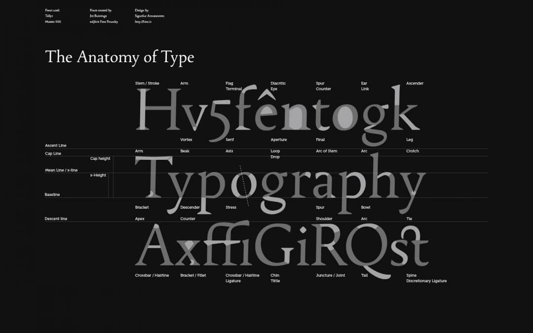
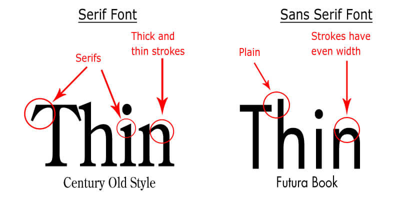
The first choice you’ll run into is choosing fonts with or without serifs. Serifs are defined as:
…small decorative lines added as embellishment to the basic form of a character
Fonts (or typefaces) are usually grouped into serif fonts and sans-serif fonts (those without any serifs). Sometimes serif fonts are referred to as Roman fonts, while sans-serif fonts can be called Grotesque or Gothic fonts.
Often websites are designed with a mix of complimentary serif and san-serif typefaces. In most cases, one typeface is chosen for headings and the other for body text.
Criteria for Typefaces
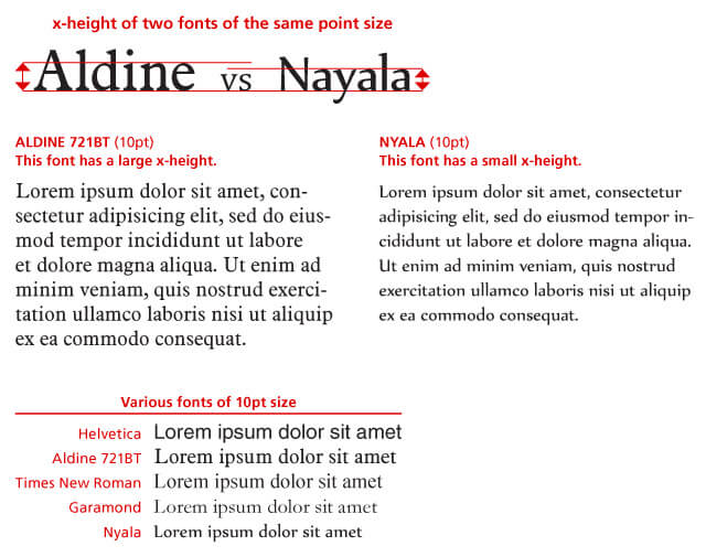
X-Height is an Important Criterion in Readability
As you go through the process of choosing a typeface for your design, here are some things to keep in mind:
- Choose typefaces offered in a variety of styles including regular, bold, italic, and bold italic. Better typefaces have all of these and are offered in a range of weights.
- Make sure that the typeface you choose has lower stroke contrast, that is the difference in size between the ‘fat’ and ‘skinny’ strokes in the letters. When higher contrast typefaces are set at smaller sizes, the ‘skinny’ strokes can become hard to read.
- Use typefaces with a good x-height for optimal readability. A small x-height will make the text hard to read; just like text set in a typeface with high contrast.
- Eschew special or decorative fonts for body text.
https://thedesignteam.io/the-type-snob-f221969a884b#
Decorative and Other Special Typefaces
When designers want to incorporate a “whimsical” feeling to the site or want to set off some content in a special way, they turn to decorative typefaces. There are hundreds available, from script typefaces to special “rough” and “grunge” typefaces.
Other typefaces are designed to be used for headings only. For example, they may offer a character set restricted to capital letters only. We recommend using these typefaces sparingly.
Using Typefaces Correctly
Things Like Width and Stroke Contrast Can Greatly Affect The User Experience
Once you’ve chosen the typefaces for your design, here are some guidelines that will help you use them to your advantage.
The first thing to do is to fight the temptation to use too many in your design. In most cases, mixing more than three typefaces on a site leads to a less pleasing user experience. If you insist on using more, be sure they are from the same or complimentary families.
Be Consistent in Your Use of Them
The eye can be a funny thing, once it gets used to seeing something, it’s quite jarring when it encounters something different. So if you’ve chosen a particular headline typeface and size, use that throughout the site; same with the body text. That doesn’t mean that your headings can’t scale in size, in fact they should. It means that the page heading should have the identical font and font size from page to page.
Some font pairing inspiration: https://www.creativebloq.com/typography/20-perfect-type-pairings-3132120
Setting the Type Correctly
We want to set the type in a way that makes the content easy to digest for site visitors. This covers everything from justification, tracking, and line spacing to the colors and orientation the text is displayed in.
The Value of Negative Space
Critical to the site visitor’s ability to visually “access” and digest the page content is more about what’s not there, than what is in many cases. We are referring to the use of negative space (also referred to as white space) to give text room to ‘breathe’.
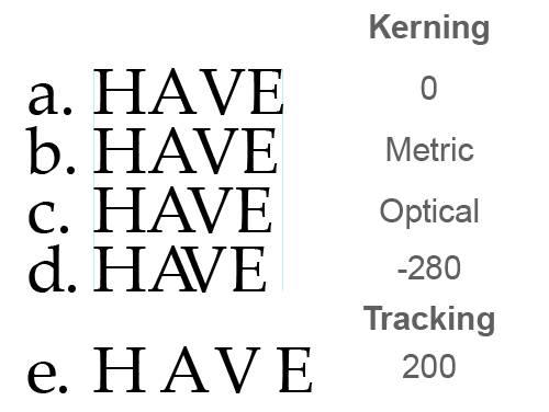
Tracking and Kerning Settings Affect Space Between Letters and Letter Pairs
If text is too densely placed it is simply hard to read. Make sure settings like tracking (the space between letters) and line spacing (also referred to as leading) are set for optimal readability. Set margins and padding so that there is space around text blocks.
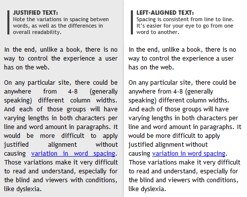
Fully Justified Text Can Be Hard to Read on Mobile Devices
While there’s no hard and fast rule on using negative space, you can bet if a page looks crowded to you, it will to your site’s users too.
Does It Look Right?
In addition to considering space around text and between it, settings like justification can greatly affect readability too. This is especially true for mobile users where screen widths are limited.
For example, text set to full justify might look fine on a desktop display in a wide column presentation, but display with unsightly and distracting “gaps” when shown on mobile screens.
And if you’ve chosen something a bit “radical” like vertically-oriented text, how does that look on mobile? After all, with nearly two-thirds of people accessing the web regularly on mobile devices, you can’t afford anything less than an awesome mobile UX.
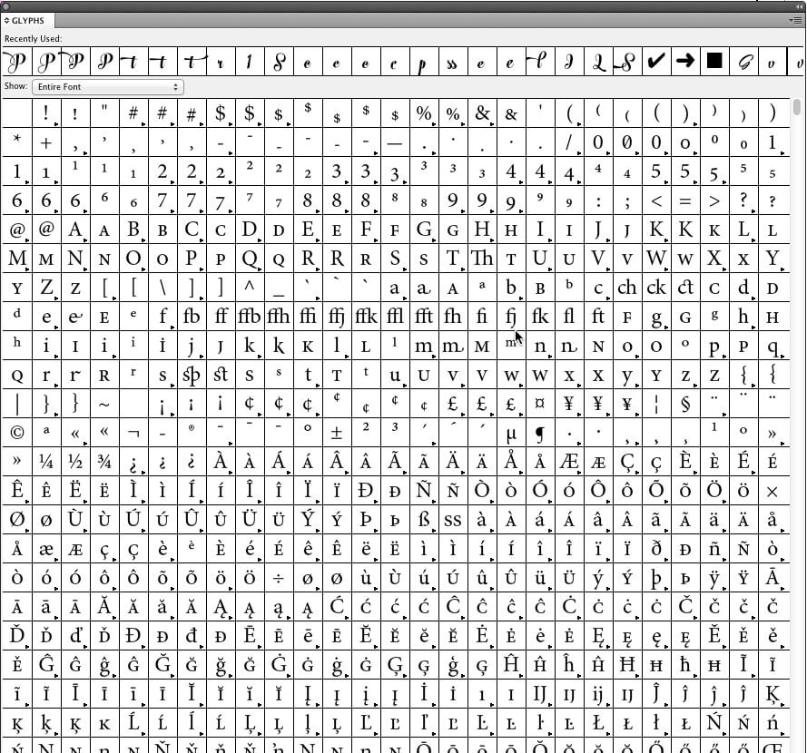
A Good Typeface has a Wide Range of Glyphs to Support Foreign Languages and Special Uses
Accents and Glyphs
Many fonts offer glyphs (alternate versions of specific characters) and ligatures (stylistic ways of joining adjacent characters). Especially if you are producing content for non-English speaking site visitors, make sure the typeface you’ve chosen is up to the task.
If you’ve chosen a special headline typeface, check carefully that it offers what you will need to meet the requirements of your design—these typefaces are quite often limited in their support for alternative characters, glyphs, and symbols.
Summing it All Up
Typography is a critical element of website design. After all, it is how the bulk of the information on most sites is conveyed to the user. And frankly, it’s something site designers and developers could pay a little more attention to.
Additional reading:
https://designshack.net/articles/graphics/8-rules-for-creating-effective-typography/
https://practicaltypography.com/

I cut my teeth working in the technology industry, for companies large and small, during some very heady years.
After more than twenty years in corporate marketing and business development, I founded Bent Oak Marketing to exclusively serve small businesses with digital marketing.
It's one of the best decisions I ever made.


