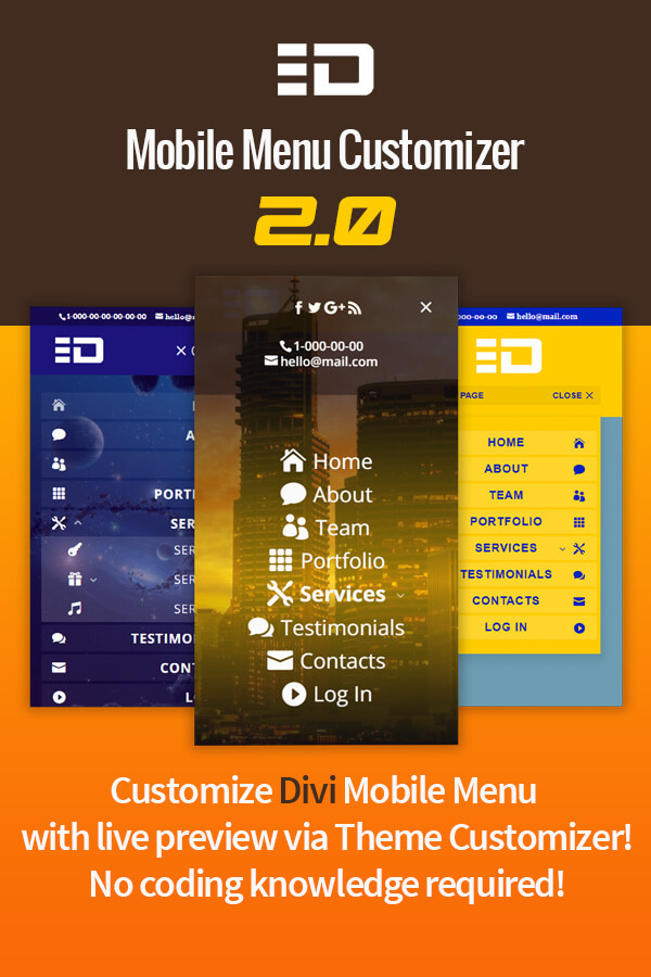
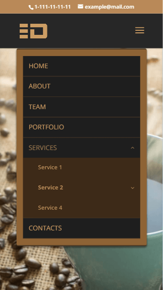
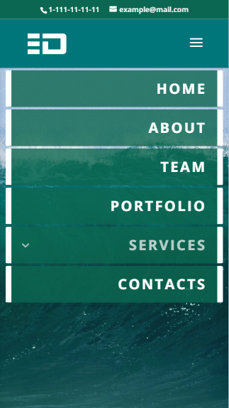
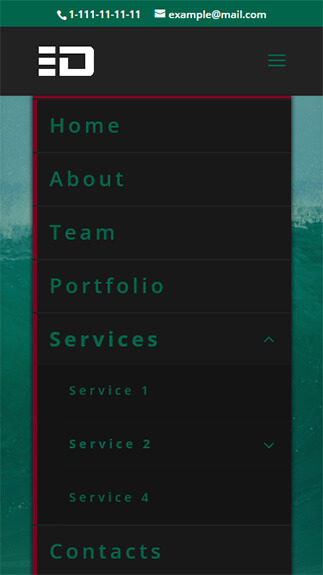
Divi theme has lots of awesome features but one of the features that it lacks is the ability to customize the mobile menu without diving into custom coding. The Mobile Menu Customizer plugin lets you style the Divi mobile menu via Theme Customizer with live preview. Just upload and activate it, then go to Theme Customizer and start styling the mobile menu, as simple as that!
Mobile Menu Customizer plugin has been highlighted on Elegant Themes Blog -> Read More
Some of the great features offered by this plugin are:
- Assign a different menu for mobile devices
- Prevent the secondary menu items from being added to mobile menu
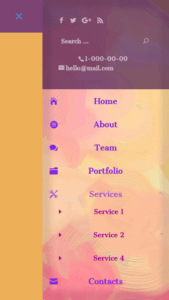
- Mobile Menu Item Icons watch on YouTube
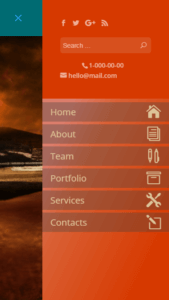
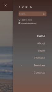
- Mobile Menu Background Image
- Type any text besides the mobile menu hamburger icon (e.g. “Menu”)
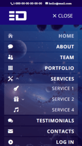
- 10 New Menu Animations watch on YouTube
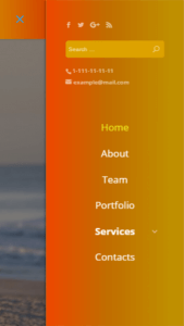
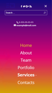
- Menu Gradients watch on YouTube
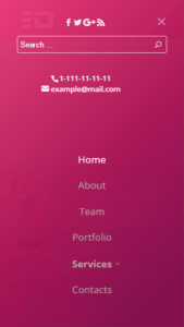
- Enable search icon for Centered and Centered Inline Logo headers
- Automatic update notifications with one-click updates via WordPress Dashboard
- Making mobile menu fullwidth
- Making mobile menu fixed
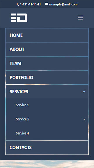
- Collapse submenus (parent menu item url remains clickable)
- Submenu Accordion feature
- 10 New Submenu Animations
- Aligning menu link text
- Adjusting menu item height
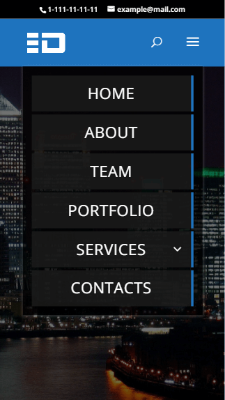
- Applying menu shadow
And lots of other controls to play with colors, borders, text sizes, margins, paddings, etc. of the mobile menu.
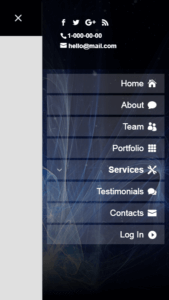
Mobile Menu Customizer plugin lets you style the mobile menu independently from desktop menu; all its settings will take effect only on the mobile menu (Tablet &; Phone). It supports all 5 header formats of Divi Default, Centered, Centered Inline Logo, Slide-In and Fullscreen, but current version of the plugin focuses more on the Default, Centered and Centered Inline Logo header formats which means that not all of the features are available for Slide-In and Fullscreen header formats. Also some of the features are not applicable to all header formats, e.g menu shadow, which is not available for the Fullscreen header format but available for other header formats.
IMPORTANT: The Mobile Menu Customizer plugin does not support the Menu Module which is used to create headers with Divi Theme Builder.
Please make sure that there is no custom code applied to the mobile menu of your site which could potentially conflict with the Mobile Menu Customizer plugin. This plugin works best with default mobile menu of Divi.


Other Divi plugins by Ivan Chi
119 Comments
Submit a Comment
You must be logged in to post a comment.
Changelog:
- v2.7.8 (02.12.2021) -- Fix: the items of the cloned mobile menu were clickable in certain situations causing unexpected redirection to a different page. - v2.7.7 (22.04.2021) -- Fix: fixed the "Make Parent Item Clickable" setting not taking effect if the parent item URL contained an anchor. - v2.7.6 (15.03.2021) -- Improvement: updated the plugin updater to the latest version. -- Fix: fixed the menu duplication issue occurring in some rare situations. - v2.7.5 (13.12.2020) -- Improvement: compatibility with WP v5.6. - v2.7.4 (30.11.2019) -- Fix: fixed the search bar alignment and opacity issues for the Centered and Centered Inline Logo header formats. - v2.7.3 (19.11.2019) -- Improvement: to prevent confusion the MMC plugin settings panel will now disappear if the page being viewed is assigned a Theme Builder header. - v2.7.2 (22.10.2019) -- Fix: fixed the issue with the MMC menu icons feature affecting the Menu Module items too. -- Fix: applied fix for the menu hamburger icon alignment issue introduced with Divi v4.0 . -- Change: renamed the Top Bar BG Color option to Secondary Menu BG Color(in Menu Settings section) to better reflect its purpose. - v2.7.1 (11.09.2019) -- Fix: fixed the error preventing the dropdown menu from closing after clicking the menu anchor link. - v2.7 (05.09.2019) -- Plugin rewritten from scratch. -- New: Plugin is now translation ready. -- Optimized the CSS output. -- Minor UI improvement: control descriptions are hidden by default now and can be opened/closed by hovering over the control and clicking the help icon. -- Fix: fixed the menu items padding issue when the icons feature enabled. -- Fix: fixed the range control width issue. -- Fix: fixed the menu search form width for the Centered Inline Logo header format. - v2.6.7 (28.03.2019) -- Improvement: updated the plugin updater to the latest version - v2.6.6 (05.03.2019) -- Fix: fixed the menu items icons not showing after save -- Fix: fixed the menu items list not being displayed for icon selection -- Fix: fixed the secondary menu items multiple cloning issue - v2.6.5 (04.03.2019) -- Fix: fixed the "undefined property error" thrown when the menu was not assigned - v2.6.4 (13.11.2018) -- Fix: fixed the issue with settings default values not being applied correctly in some cases - v2.6.3 (31.08.2018) -- Improvement: improved compatibility with third party plugins - v2.6.2 (01.08.2018) -- Fix: fixed a bug preventing the MMC plugin from correctly detecting that the active theme is Divi -- Fix: fixed the Warning: A non-numeric value encountered - v2.6.1 (17.07.2018) -- Fix: fixed a php error occuring in certain cases - v2.6 (21.04.2018) -- New: added support for Divi Layouts. Now you can create your mobile menu layouts in Divi Builder and add these layouts from Divi Library to mobile menu. Works for the "MMC Mobile Menu" location menus and is available for the Default, Centered and Centered Inline Logo header formats. - v2.5.1 (19.04.2018) -- Improvement: enabled menu item icons feature for the menu assigned to the "MMC Mobile Menu" location -- Fix: fixed an issue with the menu items customization causing a JS error in Theme Customizer - v2.5 (17.04.2018) -- New feature: added a new menu location(MMC Mobile Menu) allowing you to use a different menu for mobile devices -- New feature: prevent the secondary menu items from being added to the mobile menu or move them above the main menu items - v2.4 (01.04.2018) -- New feature: added the Accordion feature allowing to have only one submenu opened at a time -- New feature: added Submenu Animation feature(including No Animation option as well) -- New feature: added Submenu Animation Duration option - v2.3.2 (28.03.2018) -- Fix: fixed a bug causing the default dropdown animation not work as expected -- Improvement: minor codebase improvements - v2.3.1 (27.03.2018) -- Fix: fixed CSS issue affecting alignment of the search icon on desktop menu - v2.3 (14.03.2018) -- New feature: making the parent item of collapsed submenu clickable is now optional -- New feature: added set of controls to customize the parent menu item arrow to make it more visible (select icon, colors, size, etc.) - v2.2.1 (05.02.2018) -- Improvement: parent menu item of collapsed submenu is now clickable (for Default, Centered and Centered Inline Logo header formats) - v2.2 (25.12.2017) -- New feature: added a control for making fixed dropdown menu scrollable(allows you to remove scrollbar if your fixed menu doesn't need to be scrollable) -- New feature: added a control for enabling fullwidth menu on tablet screens too (<=980px) -- Improvement: improved fullwidth menu feature for phone screens (<=479px) -- Improvement: multi-input controls now have the "reset to default" functionality -- Improvement: increased ranges for dropdown menu top offset control and shadow controls for more flexibility -- Improvement: various code optimisations -- Misc: renamed plugin name appearing on Plugins page to "Divi Mobile Menu Customizer" for consistency with other plugins -- Misc: updated plugin Customizer settings panel color scheme for consistency with other plugins -- Fix: fixed page content padding-top issue occuring when fixed mobile header is used with non-fixed transparent desktop header -- Fix: fixed z-index issue with menu search form enabled on mobile for Centered and Centered Inline Logo headers - v2.1.2 (14.11.2017) -- Fixed multiple logo container creation issue occuring on window resize for Centered Inline Logo header format. - v2.1.1 (30.10.2017) -- Fixed automatic updates issue. - v2.1 (18.10.2017) -- New Feature: Added an option to enable search icon for Centered and Centered Inline Logo header formats which also allows to enable/disable search icon on mobile for Default header too. - v2.0.5 (13.10.2017) -- Improved compatibility with other third party plugins. -- Fixed a bug which caused wrong calculation of desktop header top offset in certain cases. - v2.0.4 (07.10.2017) -- Fixed an issue where header was overlaping the page content occuring in some cases with disabled fixed navigation. - v2.0.3 (28.09.2017) -- Fixed minor conflict issues with the Fullwidth Menu Module. - v2.0.2 (25.08.2017) -- Fixed menu bar top offset issue for non-fixed mobile menu. - v2.0.1 (24.08.2017) -- Fixed wrong calculation of top offset causing issue with scrolling to anchor when fixed mobile menu enabled. - v2.0 (12.08.2017) - The biggest update so far! -- New Feature: Added set of controls for adding the Background Image to mobile menu. -- New Feature: Added set of controls for adding the menu item icons. -- New Feature: Added the Background Clip control to menu gradient feature. -- Replaced the "Menu Item Height" control with the "Menu Item Padding" control. -- Optimized CSS output. -- Implemented various codebase improvements. - v1.4.1 (07.07.2017) -- Fixed top offset issue for fixed mobile menu. - v1.4 (19.06.2017) -- Added Menu Header Settings section including options to add text besides the hamburger icon (ie "Menu"), select the menu icon format (with or without text), use "X" icon for closing menu, etc. - v1.3.2 (05.06.2017) -- Improved support for vertical navigation. Fixed header and content top offset and top navigation padding-top issue occuring when vertical navigation enabled. - v1.3.1 (02.05.2017) -- Fixed conflicts with the Fullwidth Menu Module. - v1.3 (31.03.2017) -- Added 10 new mobile menu animations for the Default, Centered and Centered Inline Logo header formats. -- Fixed fullwidth menu issue in IE. - v1.2.1 (20.03.2017) -- Fixed issue with dropdown menu not closing on menu item click. -- Fixed issue with scrolling to anchor where fixed menu header was overlaping section content on scroll end - an important improvement especially for one-page sites. - v1.2 (07.03.2017) -- Added gradients feature for menu header and the menu. This feature is available for all 5 header formats of Divi. - v1.1 (02.03.2017) -- Improved fixed mobile menu feature by making long mobile menu scrollable, now you can apply fixed menu feature even if your mobile menu does not fit into mobile screen, users will be able to scroll the menu. -- Added a new control for adjusting fixed mobile menu max-height, this control shows up as soon as you apply the fixed state to menu lets and you change the max-height of fixed menu. - v1.0 (23.02.2017) -- Initial ReleaseCheckout the documentation first and if you still need help open a support ticket.
View Docs- You may install this product on the number of websites that you build for yourself or your clients according to purchase.
- You are not allowed to resell or redistribute the plugin in any form or by any means without prior written permission of the author. We kindly ask you to respect developer’s work.
- By purchasing the Mobile Menu Customizer plugin for Divi you receive 1 year of updates and support. Premium support charges may be incurred after this period.
Please be aware that you will need an amount of experience in Divi Theme and WordPress to take advantage of our themes and plugins.
Please make your decision to purchase based on your skill level to see if our products fit your needs. Due to the nature of Digital Downloads, Refunds are not possible – please ensure that the product you are buying will do the job you want it too.
All support for products is handled by Vendors and contact details will be included in the download packages. If contact details are not found within the files, please do contact us and we will be happy to put you in touch with the vendor concerned.
*Support is provided by vendors directly.
Please login to access the support form. you can do so here







Last update was one year ago?
I just renewed your plug in but noticed that it is not working with my website due to it having a global custom theme builder header and footer. Is this not compatible with the new theme builder. Also, your plug in shows for a few second in the theme customizer and then disappears.
Hi Victoria,
MMC plugin cannot be used to customize Theme Builder headers, that’s why the plugin settings section disappears(similar to Divi’s built-in header settings) in Theme Customizer when you load a page which has been assigned a Theme Builder header. You can use the MMC plugin to customize Divi’s native/default header only.
Have breakpoints ever been implemented in MMC yet????
This comment is 31 months old and yet I do not see any settings or controls for breakpoints.
Hi Mike. No, MMC plugin does not have this feature yet.
Does the Unlimited sites still require annual re-subscription fees? If so, what are those fees each year?
Hi Steve.
The Unlimited Sites license allows you to activate your license on unlimited number of sites and the license is valid for 1 year. So, you’ll need to renew it every year. Renewal discount is 50%.
How do I contact support? My mobile menu all the sudden stopped appearing on the home page. I tried going through Elegant Marketplace support but they told me to contact the vendor. However, I can’t see a way to contact the vendor. When I go to the support tab, it asks for a license key and when I input it says invalid yet I just used this license key on a website so I know it’s good.
Via the support tab on the product page
Hi Jennifer,
please submit your support request by filling in the form here https://divicio.us/support/, I’ll check it asap.
Hi there,
The plugin is quite great! I have a pre-sales question: I have a website with five levels of navigation. My customer ask me to keep the active link color of the sub-menu for a better user experience. It is possible to do that?
Thanks in advanced!
Regards.
Hi brevaweb5,
thanks for reaching out. Yes, you can set the color of the current/active submenu item, it will be apllied regardless of the submenu level number.
Hi Ivan
I am looking at purchasing Mobile Menu Customizer for Divi. Is it possible to have your mobile menu work on all platforms – mobile, tablet and desktop? Can I set up Divi and your plugin to do that? I have a simple menu with only 8 items, which look best listed under the hamburger icon on all devices. Thanks, Chris
Hi Chris,
thanks for reaching out. Current version of the MMC plugin allows you to customize Divi menu only for mobile devices(phone and tablet) but not desktop.
Thanks. Pity, as I like your version best!
Hello Ivan,
I have bought plugins for 5 sites, why can I only use for 3 sites? Thanks.
You have it activated on 6 sites including local host. Log in to your account and deactivate 2 sites and you should be good to go.
Trying to purchase mobile menu customizer. I get the following error from PayPal
“Invalid regular period. You must specify valid values for the A3, P3 and T3 parameters for a subscription”
This has now been fixed..
Thanks but still getting same error.
Please try another browser as it may be a caching error.
Thanks for your help. Cleared cache, worked fine. really good plugin a must have.
Good News! 🙂
Hey Ivan,
i like your Plugin. Ist it possible to make a different mobile menu with a different menu? cant finde die settings. and my menu has also a problem with fixed anchor points on my one page subpages.
greetings kris
Hi Kris,
yes, you can create a different menu for mobile, to do that create a menu in Appearance->Menus and assign it to the MMC Mobile Menu location. Currently this feature is available for Default, Centered and Centered Inline Logo header formats.
Regarding the anchor points issue, please submit a support inquery here https://divicio.us/support/ and I’ll check it asap. Thanks.
Hey… i found the mobile menu settings 🙂 i did an support a few minutes ago…… the menu works great, the anchors also, but when i switch to another sub-onepage the menu appears und disappears quickly. and after that i have to reload the page one or two times to make it work again.
https://www.bw91.de/1-mannschaft/#1Mannschaft
https://www.bw91.de/2-mannschaft/#2Mannschaft
switching betweens those sites makes to mobile menu not useable.
I replied to your ticket, please check.
Love your Plugin! 🙂 Is there a way to keep the main menu item active when there are submenus connected to it. We are using a “Contact Us” page with a “Careers” as a dropdown/sub menu but when in mobile view the “Contact Us” menu becomes inactive.
Hi Greg.
v2.2.1 is coming today and it will do exactly what you are asking for 🙂 Make sure your license key is activated so that you can update the plugin via WP Dashboard.
v2.2.1 is released, please update to the latest version.
Hi! I got a strange problem with a weird margin-top above the mobile menu. If I disable the plugin the margin is gone, so it definitely is caused by MMC. In a locally hosted duplicate of the website I have removed all custom css and the margin still existed. Could please take a look? Thanks in advance.
Hi Christian.
Please contact me via support email (you can find it in the documentation file) with all details regarding your issue (screenshot, etc), I will have a look asap. Thank you.
I got a big problem, when activating the plugin, the content is shown inside the Menu. The space between the content and the mobile menu is not enough. Without the plugin everything works. Any idea for this?
Hi Sylvia.
Please contact me via support email (you can find it in readme file) with detailed info about your issue and including your order information, I will deal with it immediately.
Thank you.
Ok thanks so much Ivan.
Sorry my English is not very good!
Can you create the same plugin for desktop devices ? not just for mobiles devices ?
I want to modify the appearance of the divi menu also for the desktop Ivan.
Ok, no problem :). Support for desktop header is actually in the list of future updates but I cannot talk about a certain deadline for it now.
Sorry :
for desktop 🙂
What do you mean, can you please elaborate?
Hi Ivan
The module is there for office, if not we need it!
Hi, Ivan:
I am enjoying your plugin but have one issue with the API key registration page. When I enter the key and click the activate button it does nothing. I’ve checked on my purchase tracking page and confirmed that no new activation is shown. I also contacted the Elegant Marketplace support team and they had no solution. Is this something you can address on the implementation end, with an update? No hurry, as I can still use the plugin, but I do want to make sure it’s all working right. Thanks so much for a GREAT plugin! –Leha
Hi Leha.
This is a known issue and is going to be fixed soon but this does not create any issues with plugin usage, it is fully functional.
And thanks for your kind words, I am glad you like the plugin.
Hi,
Can I try it on my website before buy it?
Thanks
I am afraid we do not offer this facility.
How can i set custom css to get Background transparent?
Hi Sylvia.
You don’t need to apply custom css, you can set background color transparency in Menu Settings->Menu Background Color.
Bought the menu and it does everything I was hoping for, except one thing:
Can I resize the height of the mobile menu header? I’ve always felt like it was too large, and it’s also obscuring a gallery lightbox, so that’s an issue.
I saw you can resize the height of the menu that pops in, which is great, but hoping to resize the mobile header itself.
Thanks!
Hi Shaun.
Currently resizing the mobile menu bar feature is not available but it is in the works and I will add it in coming updates. If you want to do it manually please send me an email to support email address with the link to your site, I will try to help you asap.
Thanks.
Thanks for the response! Which support e-mail can I reach you at? I would love if there was a way to do that through CSS 🙂
You can find the support email in the doumentation file (readme file).
Hi,
Is it possible to assign a different menu for mobile than the main one used for desktop?
Hi JXoo.
Currently assigning a different menu is not possible, but it is in the list of planned features.
I am strongly considering buying this plugin. Before I do so, i’d like to know one thing. the site I’m working on I created all the pages using the “blank page” option. Meaning, they dont use the default divi menu.
Will i still be able to use the divi menu for this plugin on the mobile view?
Thanksl
Hi DB.
Thanks for being interested in this product.
Blank page template does not have a header so, using MMC plugin will make no sense since it is designed to work with Divi header only. You will be able to use this plugin only for those pages which have the Divi header enabled (but you won’t be able to use it for menus created using the menu module or any other plugin).
Regards.
I use a Background Image in the top bar, is it possible to still show that? I only find Background image for Dropdown Menu?
Hi Sylvia.
Yes, you can keep top bar background image, current version of the MMC plugin allows setting background image for the menu only(not top bar).
Hi! It seems like this mobile menu has a conflict with anchor points. On first ‘click’ it pulls the anchor point to the bottom of the screen, on second ‘click’ on the same menu item it pulls to the correct position. Disabling the plugin makes the anchor points work as intended, but the menu looks hideous :’D got any ideas on how to fix?
Hi Andreas.
Looks like there is some other script/plugin that might be causing a conflict considering that the menu looks hideous (as you say) even after deactivating the MMC plugin. Please send a support query to the support email which you can find in the readme file, I will deal with it asap.
Thank you.
Hi Andreas. This issue has been fixed in v2.0.1, please upload the latest version of plugin.
Hi,
Would I be able to add a search field to the top of the mobile menu? Is it possible to add widgets?
Hi Jacqui.
Search can be enabled/disabled in Divi core Theme Customizer settings. Adding widgets is not available yet but on the list.
Hi I purchased the plugin and have a few questions… how do i contact support??
Hi TJ.
Please check the documentation file for support email addresses(the readme file). Thanks.
my menu has a scroll bar for no reason (its only 3 menu items when submenus are closed). and how do I change or get rid of submenu animations???????????
Hi Daniel.
The scrollbar shows up for the fixed mobile menu, it is done so that long mobile menus be scrollable and fit into the screen. However, it is not useful for short menus, as in your case. So, I will add an option to control this in the next version. I am working on submenu animations too.
Option for making fixed menu scrollable has been added in v2.2, it allows you to hide horizontal scrollbar if your menu does not need to be scrollable.
Hey Ivan,
i have an issue with a fullwith custom menu.
If i use the wordpress main menu your plugin works really nice. But i had to use a custom menu to display it on mobile and it looks very bad. The sandwich menu switches to the top and you can´t see the first menu item. As well the colour-setup does not work. So i had to deactivate the plugin to get the normal functionallity unfortunately.
This happens only if i use the fullwith modul within divi. Will you fix that in a following update? Otherwise this plugin does not work for me ;-(.
Hope to hear from you.
Best regards,
Alvaro
Hi Alvaro.
Which version of MMC plugin are you using? Compatibility issues with the Fullwidth Menu module have been fixed in v1.3.1, if you use an older version then please download the latest version. But if you will still have problems then please contact me via support email with all the details of your issue, I will check it asap. Thank you.
Hi, is this plugin compatible with the Extra Theme?
Hi, Nico.
No, current version of the Mobile Menu Customizer is compatible with Divi theme only.
Hi Ivan,
I purchased the plugin and I love it! Question- How do I adjust the height of the mobile menu? It’s too big and it’s cutting into the header. Not upon scroll, when you scroll down the height of the menu shrinks. It’s the stationary height of the fixed menu that I need to be smaller.
Hi JB. Great to know you love it, thank you :).
Currently there is no such a setting to adjust mobile menu header height yet. Anyway, feel free to contact me via support email that you can find in the documentation file, I will be glad to help you.
Hi Ivan, will this MMC work with your divi child themes? I am using your App Showcase child theme but am not a fan its mobile menu.
Hi Craig.
Normally, the MMC plugin is supposed to be used with default Divi mobile menu to ensure that there won’t be any conflicts with the settings of MMC plugin and the custom code. App Showcase child theme has a custom menu structure&styling and has its own Customizer options for styling its mobile menu . MMC plugin will work for most part with the App Showcase child theme (minor conflicts will occur) but you won’t be able to change the 2-column structure of this child theme’s mobile menu.
Hello Ivan Chi,
how do I change the breakpoint of the mobile menu using your plugin?
Changing the breakpoint, I want the burger icon to appear on larger screen sizes and avoid a line break in the desktop menu.
If I use this piece of CSS, your plugin does NOT seem to work anymore:
@media only screen and ( max-width: 1360px ) {
#top-menu-nav, #top-menu {display: none;}
#et_top_search {display: none;}
#et_mobile_nav_menu {display: block;}
}
What am I doing wrong?
I urgently would need to change the breakpoint.
I highly appreciate your help. Thank you very much in advance
best
Michaela
Hi Michaela. Currently the MMC plugin works only for default breakpoints of Divi (<981px) , it does not have an option to change the breakpoint yet. But this feature will be added soon, along with other features that are requested by the users of Mobile Menu Customizer plugin.
Hi Ivan again,
the switch for the mobile menu in Divi was changed to 1240px instead of 980px.
I customized the files chidmm-controls.php and customize-preview.js and now it works!
It would be a great feature to change the “max-width” in the customizer 🙂
Greets,
Artur
Hi Artur. Sorry for not being able to answer your question, was out of reach for a day. Glad to know you fixed it, will consider your idea for the next update, thank you 🙂
Hi Ivan,
i bought your plugin and noticed that the customized menu aapears only on mobile Portrait size (sreen-width: x-980) not on Landscape sizes (981-).
On landscape size i see the default Divi mobile menu, how can i change this behavior?
I want to see the customized mobile menu always if the screensize is smaller than for desktops.
You can check it here: https://steuerberater-dr-weiss.prodevsol.at/
Greets,
Artur
Hi,
I just wanted to ask if with this plugin we can choose another menu to show on the mobile or not.
for example the menu in the desktop has 10 items and each items has more than five submenu.can i show diffrent menu on the mobile with this plugin to sho only 2-3 items in the menu?
Hello Mishel.
This plugin does not allow to choose which menu items to show and which not to show on mobile but it allows you to collapse submenu items so that the menu doesn’t become too long on mobile. The user will see only main menu items and will be able to expand/collapse submenus if they need to.
Hi Ivan,
if the first level menu item would clearly make a difference between menu item and expand/collapse icon for child pages, then it would be a great feature which is widely used on the web and exactly what I´m looking for, too. Would you consider to add this feature? It´s the only reason that holds me back from buying your plugin.
Regards
Erik Petersen
Hi Erik. There is a long list of features already requested by the users of the MMC plugin and I am trying to add them one-by-one. Your requested feature is the list too but, frankly, can’t tell you when it will be added. I am always working on improving this plugin , so, thank you for the feature suggestion.
Any news on this wanted feature?
And is divicio.us the same?!
Hi Erik.
No, this feature is not added yet. And yes, here I sell the same plugin as on divicio.us.
Hi Erik Petersen.
v2.2.1 adds this improvement, now if the parent menu item has a link then it will still remain clickable after collapsing the submenu , and clicking the arrow will open/close the submenu
Can we set a width for it to take effect? I would like it to go into effect at 1200 px but I don’t see a setting.
Hello Shelley.
Current version of the MMC plugin effects the default Divi mobile menu only ( <= 980px), it does not have a setting to change this.
And with a CSS ?
It depends on which header format you are using, e.g. Centered Inline Logo header uses JS to add/remove the logo and this is something you won’t be able to do using CSS only. For the most part you will be able to change breakpoint using CSS but it will be different for different header formats and you’ll have to consider fixed vs non-fixed, vertical-left , vertical-right, etc. cases. And then there are core header Customizer options that need to be adopted to a new breakpoint in order to function properly and to do this you’ll need PHP skills. This feature (along with many others) is in the list and I hope to implement it soon.
Hi Ivan,
i the first picture below the description i can see the search filed above the menu items, can i set this in the settings for the mobile menu?
I know, i have to activate the setting also in dii settings but i’m looking for a plugin where i can show the search field always on the top of the mobile menu.
I don’t like the magnifying class in the mobile menu of divi.
Best regards,
Artur
Hi Artur.
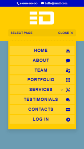
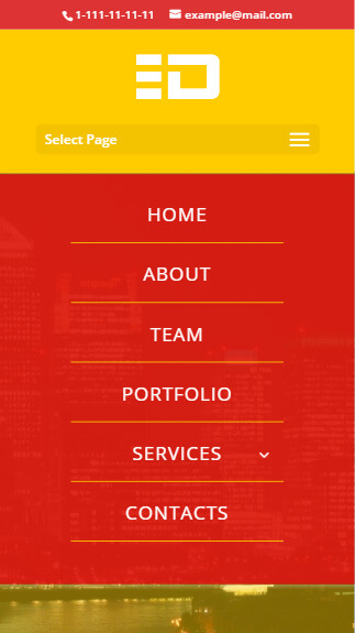
Not sure which picture do you mean but if it is the red&yellow one then the line with “Select page” words is not the search field but it only indicates that it is menu there. MMC plugin currently does not provide such a feature.
Hi,
in one screenshot i see a search field but you don’t show this in the video.
Can i also a the search field to the mobile menu?
Best regards,
Artur
Hi Artur.
To enable search icon you need to go to Divi -> Theme Customizer -> Header & Navigation -> Header Elements and check the SHOW SEARCH ICON checkbox.
Hi Ivan,
The top menu (with phone # and email) have no more margin and hiding the logo and the humburger menu? Something I can do?
Hi Lucas,
Could you please send your inquery with more details to support @ divicio.us (including screenshots, link, etc.) so that I could investigate your issue?
Thanks.
Hi IvanChi, I have installed your plugin on localhost.
I have noticed that the menu doesn’t close after clicking a menu link. Is this a default setting?
I can only close the menu by clicking the hamburger icon (again).
Question: default setting or something wrong?
Hi Tomatito.
This is going to be fixed with the upcoming update too, by default the menu should close on item click, thanks for pointing out.
This issue is fixed in the v1.2.1 of MMC plugin, now menu closes after clicking the menu link, please upgrade to the latest version.
Ok, finally i got it playing with the gradient, thanks anyway, nice plugin!
Hi Ignacio.
Yes, you can achive that result with the help of gradients, first you set the stop colors and then experiment with their locations.
Hello, want to do this two color effect (No gradient), the dark blue light blue.
[IMG]https://i67.tinypic.com/2n877lv.png[/IMG]
Hi IvanChi, thanks for your reply. You have just sold a plugin 🙂
Thank you for your support 🙂
Hi IvanChi,
Can you respond to my question? Thanks.
Hi Tomatito, sorry for late reply.
I will include this fix for one-page sites using fixed menu in the next version of MMC plugin which I am currently working on. Will release it in soon.
Hi, I have a Divi onpager. I use page sections as menulinks.
Whith a fixed header (possible with your plugin) will this not cut off the top part of each section?
I have already a fixed header bye using a code snippet. You can check my site to what happens on a mobile device.
So again: will your plugin prevent this? Or do you have a quick work around for this together with your plugin?
Hi Tomatito,
this issue’s been addressed in v1.2.1 of MMC plugin, the fixed menu header won’t overlap sections on scroll end on one-page sites anymore, please upgrade to the latest version.
Hi Ivan,
Thanks for your reply. That’s not a big issue and i can work around it. I want to purchase your plugin but first please tell me if 3rd category items (menu-submenu-secondary submenu) will expand as well. As stated before, i’m working on a website with this kind of menu structure. Other plugin i tried does not let me expand 3rd category items.
Thank you,
Vlad
Hi Vlad, thanks for asking.
Yes, it will collapse/expand all submenu levels.
Hi, Ivan
What happens when the submenu has it’s own submenu. Can i customize it even further? I have a website with uses
“Menu – Submenu – Sub Sub menu.
Thanks,
Vlad
Hi Vlad.
Submenu settings of the current version of MMC plugin (v1.2) will take effect on all submenu levels. Unfortunately, there is no such a possibility to customize each submenu level independently yet.
Hey Ivan,
Are the top-level navigation items in the collapsable sub-menus still clickable?
As in, does clicking the arrow expand/collapse the menu, but clicking the text still open the link on the same link with the arrows?
I’m currently using Divi Switch, but it is not able to do this and looking for an alternative which can.
Thank you,
Mike
Hi Mike.
No, clicking on a top-level menu item text or the arrow will open the submenu, MMC plugin does not have the feature you’re looking for. But why would you need that? Wouldn’t it be confusing and annoying?
Hi Ivan,
if the first level menu item would clearly make a difference between menu item and expand/collapse icon for child pages, then it would be a great feature which is widely used on the web and exactly what I´m looking for, too. Would you consider to add this feature? It´s the only reason that holds me back from buying your plugin.
Regards
Erik Petersen
Hi Erik. There is a long list of features already requested by the users of the MMC plugin and I am trying to add them one-by-one. Your requested feature is the list too but, frankly, can’t tell you when it will be added. I am always working on improving this plugin , so, thank you for the feature suggestion.
Hi Mike.
v2.2.1 adds this improvement, now if the parent menu item has a link then it will still remain clickable after collapsing the submenu , and clicking the arrow will open/close the submenu
Hi Good morning, just wanted to ask if this plugin is compatible to the divi builder only with a different theme? Thanks!
Hi BJ Dollison.
No, this plugin is compatible only with Divi theme, it won’t work with other themes.