
Now you have the freedom to show separate menu items to your mobile visitors!
With Divi_is_mobile, you can easily and seamlessly display different menu items to your mobile visitors.
The Problem: When viewing a Divi website on a mobile device that uses both the Primary and Secondary menus, the two menus combine for your mobile visitors.
You may not want to show all of those links to your mobile visitors, or perhaps you just want to rearrange them to streamline your mobile menu.
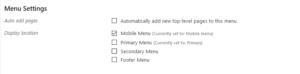
The Solution: With Divi is mobile, you have full control to show exactly the links you want to show and the order to show them in for your mobile visitors. It’s as easy as creating a menu.
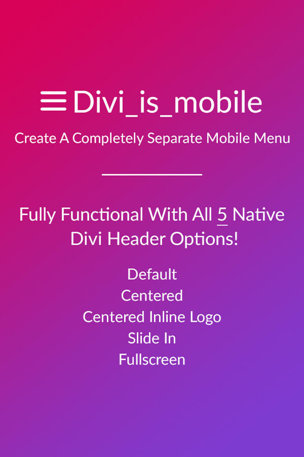
Divi_is_mobile targets all 5 of the different header options within Divi so no matter if you are using the default, slide-in, full-screen, or the centered-inline menu, this plugin will seamlessly show a completely different set of Menu items (that you choose of course) to your mobile visitors.
- Compatible with WPML
18 Comments
Submit a Comment
You must be logged in to post a comment.
Please scroll down for the support form
This theme, layout or plugin is comprised of two parts.
1. The PHP code and integrated HTML are licensed under the General Public
License (GPL). You will find a copy of the GPL in the same directory as this
license file.
2. All other parts, including but not limited to the CSS code, images and design are
copyrighted by the vendor concerned and are NOT licensed under GPL.
This license allows the item to be used in projects for either personal or commercial use by you or on behalf of a client. The item cannot be offered for resale either on its own, in part, or as part of a larger project including that being part of a hosting offer. Distribution of source files is not permitted.
*Support is provided by vendors directly.
Please login to access the support form. you can do so here


Hi Guys having the same problem as the young lady below, I have reached out on all known channels to no avail. Is this still a supported product?
Hi, I have installed the plugin, created a menu and assigned tit to he mobile menu but it isn’t showing any dropdown links when it opens. It adds the ‘Select a Page’ and the hamburger icon but none on the menu items show when you click it. Have I missed a step? I am using divi centred header option and viewing on mobile.
Thank you
Hello, I have a pre-sale question. Do you know if it is compatible with Divi Quad Menu? I have this website: https://securitydeltaone.com/ where I would like to have a complete different menu on mobile. We are using Divi Quad Menu for the Desktop website. Do you think that your plugin will allow us to create a simple mobile menu with different links?
Hello,
I just bought it – works well.
However, I don’t want to see the Mobile Menu on a tablet, but on a smart phone. Can I adjust the media Queries? Where can I do that?
KR – Marc
I can see that the comment stripped important information- I added a break tag to the menu items to have them fall in 2 lines.
Hello, I’ve got a client website where the menu items are 2 words each and the request was to have them display on 2 lines. I’ve added a in the menu to make it appear that way, which works for desktop but isn’t ideal for mobile. Will I be able to use this plugin to create a mobile-specific menu that will not have in it, or does it simply take the same menu items and lets you display them differently? This website only uses a primary menu.
Thank you.
Hello Gal,
Yes this will work for you. You are able to create a completely separate list of menu items and then assign that menu to the “mobile menu” as you would the footer, topbar, or primary menu.
If you have any other questions, don’t hesitate to ask.
Thank you
Just started using this plugin. When it scrolls it treats the top of the page as the area under the top menu bar. Any way to get this to stop its scroll under the menu bar so it lines up correctly? Thanks.
This is awesome
Thank you! Really glad you like it! 🙂
Hello! This is something I’m looking for a long time, and in fact, started do make my own plugin for this. My question is:
Can I assign a different header option for mobile, or only the menu? For example, I want to use the default header style in Desktop, but when I’m on mobile I want to use the slide-in style. Is it possible to do this with your plugin?
Thanks in advance!
Hello Nicholas,
Glad to hear you like it! We have seen many people request this feature and also had a need for it ourselves. 🙂
Currently you can not choose different header styles for desktop and mobile, just the menu links.
Please let me know if you have any other questions.
Thank you
John Lilly
Hi, will this also work when using Divi blank page templates? I do not often use the default header layouts.
Thank you
Hello Andy,
Thanks for checkin out our plugin.
This plugin was developed to target the primary navigation options in the header.
However, if you are using a blank page template, you could still show a separate menu to your mobile visitors if you added 2 full width menu modules into the page. In the first full width menu module you would choose the “Primary menu” and then hide that module for mobile and tablet in the divi settings. In the second module you would select the “Mobile menu” and then hide this module for desktops.
Please let me know if you have any more questions.
Thank you
John Lilly
Hi. One question. I use a Divi child theme and have a language switcher in the secondary menu, which is shown on top in desktop view. My goal is, to have the same on mobile.
Does your plugin give the possibility to separate the menus on mobile, so that the language switcher is not integrated in the “main” mobile menu? what customization options are possible for the menus?
Hello Emanuel,
Our plugin allows you to create a new menu which you can organize the menu items any way you would like and then show that specific menu to your mobile visitors instead of the standard Divi setup which takes the secondary navigation items and adds them to the primary menu for mobile.
I hope this answered your question.
Please let me know if you have any other questions.
Thank you
John Lilly
I don’t see a difference between “Centered Inline Logo Header” and the “Centered Logo Header”
Hello David,
The difference between the Centered and Centered-inline header options is where the logo is positioned. If you choose the option for “Centered logo” in Divi, your logo will be centered above the navigation on desktop. If you choose the “Centered-inline” header option within Divi, the logo will be centered between the menu items on desktop.
Please let me know if you have any other questions.
Thank you
John Lilly