It’s been a crazy few years in the world of WordPress, and the growth of page builders has been as much a part of that as the launch of Gutenberg. In this post I’ll compare Oxygen, a relative newcomer on the scene, with Divi, a leader in the market for some time.
[Full disclosure: the great bulk of my experience has been with Divi. But, over the past four months I have been working with Oxygen].
And, before I get into specifics, I want to acknowledge that almost every product we once called a page builder (like both Oxygen and Divi), is today really a “site builder”.
Differences at a Glance
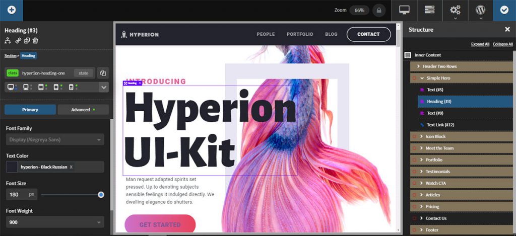
The User Interface
At this level, the products are very different, one could say night and day. That’d be a very apt description because at the UI level, Oxygen could be described as “dark mode”, while Divi has a very bright interface. While not operationally significant, there are likely significant user preferences one way or the other.
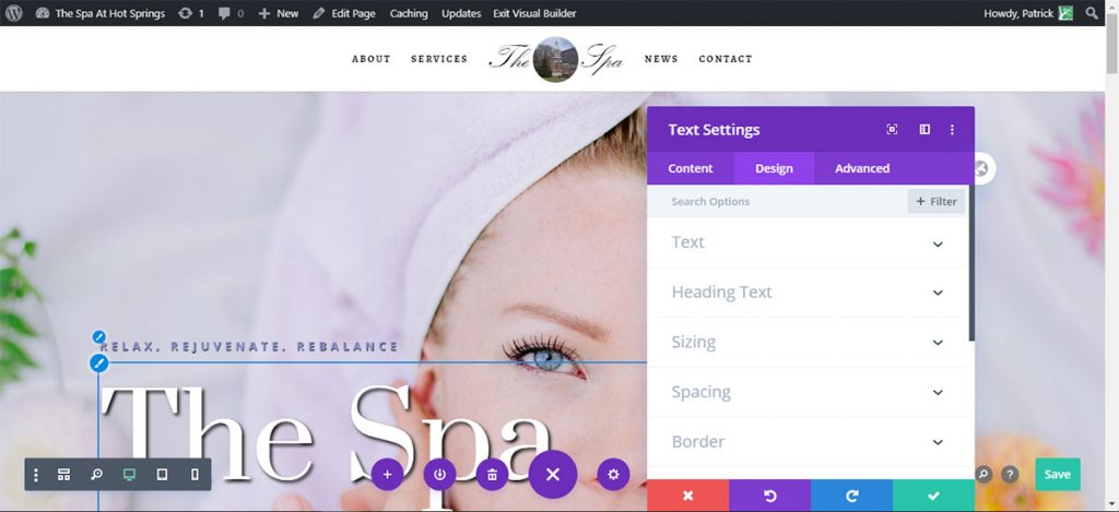
The Editing Environment
Like many similar products, Oxygen does not have a true front-end editor like the Divi Visual Builder. It does present a visual representation of the page that can be adjusted to various zoom levels. And you do get limited text editing and drag ‘n drop arrangement of elements on screen, but there simply is nothing remotely like the “TinyMCE-like” content editing boxes offered by Divi’s modules.
Similarities between Them
It’s not hard to imagine that there’d be many similarities between products that serve the same function—surprisingly, in comparing Oxygen and Divi, there aren’t that many.
The Templating System
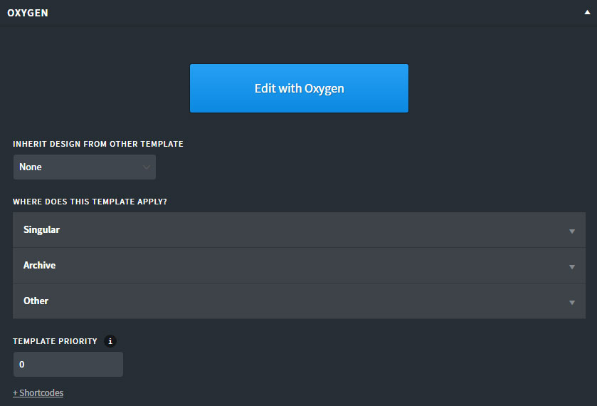
When I initially started working with Oxygen in September, Divi 4.0 had not yet come out. So actually Oxygen was the first product I ever used with “theme builder” capability. When Divi came out in October with 4.0, I was amazed at how similar the two approaches are. Truly!
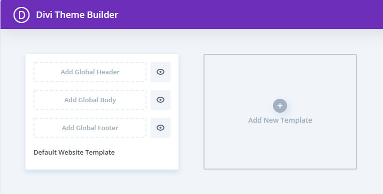
Both of them simply break a page into three parts: header, main content, and footer, allowing the designer to put the full design power of each product into styling any or all of those areas. Then they further ask you which page(s) the template should apply to.
This implementation is simple, flexible, and powerful. And as far as I have found, neither product puts any limits on how many templates you may have.
Structure/Tree View
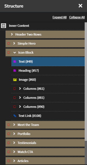
For many web professionals who’ve used these products for a while, a “tree view” of the page is like an old friend. Most tools like Divi and Oxygen have moved toward a visual development environment, but both still offer a schematic way to view page structure.
In Divi the implementation is superior because all the functionality of the visual editing views is still available in tree view, including modifying settings and adding new modules. In Oxygen, operations on the structure panel are limited to delete, duplicate, make reusable, rename, and wrap in a div—plus drag and drop reordering.
In both Divi and Oxygen, these “views” are invaluable for being able to select a component that is underneath another or otherwise hard to select.
Compared as Design Tools
Both Divi and Oxygen are marketed as tools for design of WordPress websites; to whom they are marketed is quite different. The makers of Divi, Elegant Themes, claim great websites can be made using their tool without any coding. Oxygen markets their software as a visual site design tool that can make great sites, but they’re careful to nudge their product more toward experienced users and developers (as opposed to designers).
And, in my view, this is quite appropriate because the learning curve for Oxygen is undeniably steeper.
The Approach to Design
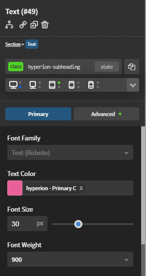
Divi and Oxygen take design on in subtly different ways. While in Divi you can use CSS classes and IDs; in Oxygen you must use them. That’s how styling is separated in Oxygen. Of course, in CSS, classes and IDs are exactly how styling is done, but Divi takes care of that behind the scenes for you.
Local vs. Site-wide Styling
An example is easy to come by. In Divi, I am fond of using their “extend styles” command to, for example, extend the style from one blurb to all the others in the same row. (But not all blurbs on the site). In Divi performing this simple operation is a single click.
In Oxygen I simply must create a class styled as I wish and apply it to elements I want to be styled that way. There’s no real short cut; there’s no easier way I have found.
Visual Control of CSS
What both products are designed to do—and they do it extremely well—is put a graphical UI in between their users and CSS. We decide we want a border, an animation, an overflow setting, sizing, whatever (almost)—and both products let us set it up without code.
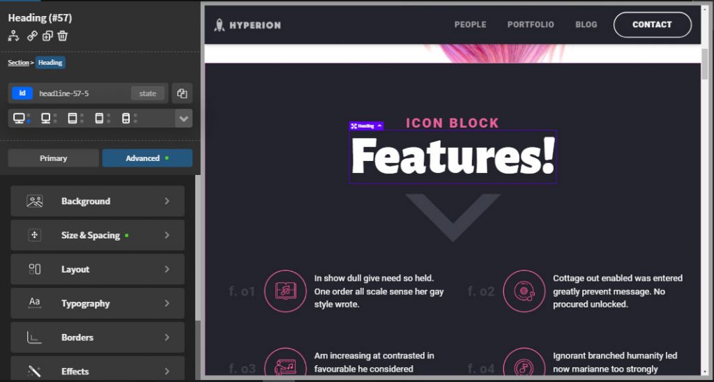
Neither product offers a UI that covers 100% of CSS; but, Oxygen has a far more extensive set of layout commands included in their UI than Divi does. Oxygen also offers direct access to pseudo-selectors like :before and :after.
Both tend to offer a variety of CSS units in their settings as well.
[In a September evaluation of page builders I did for a local Meetup, I found that Divi and Oxygen far outstrip Visual Composer, Beaver Builder, and Elementor in terms of how much CSS their UIs can set directly].
Libraries and Reusable Components
Along with a tool’s productivity features (next), a great library of designs and reusable components really helps get sites up quickly. Both Divi and Oxygen offer a huge number of superb design resources, but they do approach it differently.
Divi focuses on whole site designs, offered a page at a time. They have lots, and they are of very high quality. Oxygen does have full site designs, fewer than Divi but more than enough to get you going. (They call them design sets).
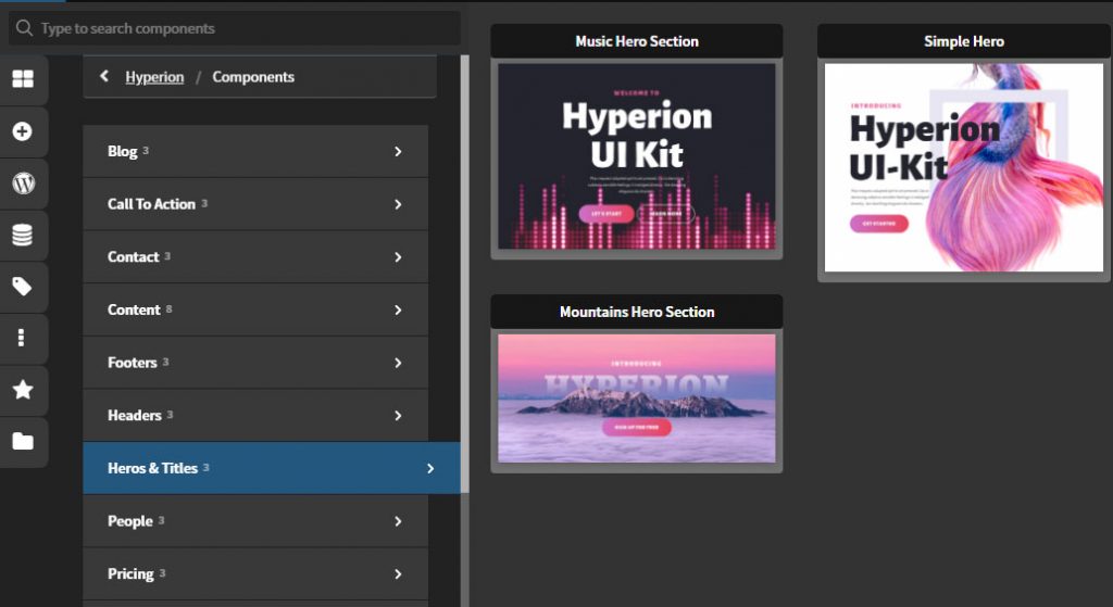
But Oxygen has two things that I love. First is a big library of piece parts: parts of pages, CTAs, headers, footers, and so on. In my view, doing it this way is a bit more flexible than Divi’s approach. Second, in Oxygen you can name global colors to use in your designs. To me, although it’s a small thing, it’s really helpful to see a descriptive English name as opposed to having to decode hex or RGB color codes.
[Both products offer reusable library components, and you can save your own. I have not seen how or if Oxygen implements global modules like Divi does].
Productivity Features
In the competitive agency world, how quickly we can complete a credible site is of critical importance—and it’s right for us to expect our site development tools to support us with features that help in the process.
I have always felt that Divi was the market leader in this type of feature, and my evaluation of Oxygen has not changed that at all. Sadly, Divi has many of them, Oxygen hardly any.
Instead of beating up on Oxygen, I just wanted to mention—really for the sake of those Divi users who are fond of them—two features that Divi has and Oxygen lacks.
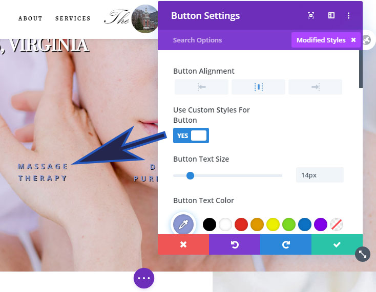
When working on a complex Divi module, the ability to filter to show only modified styles or only responsive styles is a huge time saver. And then the ability to extend styles, that’s another great tool.
Client-Side Interface
One place where Divi and Oxygen took different paths is in their client interface: Oxygen offers a single command that turns a page into a Gutenberg block where the client can only change out images and edit text.
While we as an agency haven’t transitioned clients to Gutenberg yet, there’s no denying the utility and safety of this approach.
Comparing the Output of Each
We all know that what these products are doing is writing code for us, right? The question is: how good is that code? How efficient is it? This is where the two products are vastly different.
The code that Oxygen outputs is a great deal smaller than Divi’s. Rather than get into opinions and the resulting arguments, let me just tell you that a bare Divi install on a page is over 1Mb. The bare Oxygen install is around 100kb. It’s easy to test.
In a world where time on page and bounce rate are closely watched metrics, and one where Google is measuring page speed for search rankings, you really can’t afford a slow site.
We have all seen Divi sites that are well faster than the 3 second recommended maximum page load time. But the raw page weight number I shared above with you should at least be cause for concern.
Pricing and Licensing
As far as cost goes, let me just make the simple statement that these are the two best values on the market—and Oxygen is better yet than Divi.
Both products offer unlimited sites with their licenses—something that’s rare in this market. Divi offers both a yearly license and a lifetime license; right now, all Oxygen licenses are lifetime.
I’ve resisted publishing specific prices because both products can often be found on a special. But I do have to point out that Divi is “all in one” for one price. Oxygen has a basic tier, a tier that adds Woo Commerce integration, and a final tier that adds Gutenberg support.
Updated pricing is available at: https://www.elegantthemes.com/join/ for Divi and https://oxygenbuilder.com/pricing/ for Oxygen.
Something like a Conclusion
It was never really my intent to choose one over the other, or to recommend that others do so. In fact, I think they are both great tools and that competent folks will likely be able to make a success of either.
But they are different enough that I recommend you consider where you really are as a user to decide which is best for you. I’d say that the more comfortable you are with CSS, the easier it will be to get going with Oxygen. Put differently, Divi is easier to learn.
If it’ll help you decide, my agency owns licenses for Visual Composer, Divi, and Oxygen. While the first is a legacy item, we fully intend to use both Divi and Oxygen for new business going forward.




Great article thank you, I’m a divi user but have been looking at using Oxygen. It was really helpful to read a proper in depth comparison (with useful screenshots) between the two with the emphasis on them being different (rather than better) and examples of why and how we might use one instead of the other in particular situations.
Good article. I agree with your observations and comments on what type of user or projects each of Divi and OxygenBuilder are best for.
I use both Divi and Oxygen. Divi is easier to use but less flexible and produces slow, heavy-weight sites. So I use Divi only for sites that won’t have heavy traffic or won’t be competing for better Google rankings.
I use Oxygen for sites that MUST be fast and must compete for the best Google rankings. Therefore, my WooCommerce sites are all now migrating to Oxygen. I love the flexibility provided by Oxygen.
I have oxygen, not done a lot with it as Divi is quick to spin up a site. But the bloat is something that means i have to spend time optimising. Oxygen is exciting and makes sense. Good comparison.
I more or less left Divi in July (date when I bought Oxygen) following many disappointments (+ – 18 months before the release of WooCommerce modules from Sneak Peak, waiting for a builder , worries about working in French, etc.). Following complaints from my customers because of the (too) many updates which, not every time, can break the sites (it happened several times and even if it is finally corrected, it is not serious for my clients).
The Divi Builder is still not compatible with WPML and the support still asks me to wait … (how long). Since then I have met the expectations of my customers with Oxygen (slow Divi, page that reloads without reason and so on).
Even if Oxygen is not perfect (but ultimately if there was a perfect theme / builder it would be known and there are also other parameters like the price) it is too little known and gives superior results. I start to really learn and have fun (which I had lost with Divi shortly after version 3).
In some areas it largely surpasses Divi, management of CSS flexboxes, CSS grid and with its different approach offers better performance.
After a few months and 3 more sensitive sites which I migrated from Divi to Oxygen, I don’t even want to follow Divi anymore, too design oriented and not sufficiently stable in my opinion.
The effort to get started is definitely worth it.
Great read! I am more into Oxygen these days for the freedom it enables, and for the lean-fast output, but still believe Divi 4 is a game changer and will use it for clients and personal projects. This kind of balanced and give choice to reader articles are much better than “my builder is better than yours” articles and videos we see every now and then. Hope to read more content about Oxygen in coming articles.
I absolutely agree Rami. I have mentioned this to Patrick – its a true comparison piece. I for one am very pleased with the article and hope to garner more attention to other page builders in the future on a comparison rather than a “This is better than this” type of post. Thanks so much for taking the time to comment