Bucket for Divi is a plugin that adds a new module for the Divi Builder that’s a combination of two Divi modules: Image and Call to Action. It displays everything both modules can, but the combination of the two adds a unique design element that creates the ability to display content on hover and make it clickable. It can display a background image or a background color.
- You can see the plugin here: Bucket for Divi.
In this article, I’m taking a look at Bucket for Divi version 1.5. Images were taken from Unsplash.com or from pre-made layouts, which were taken from Divi Cloud.
Bucket for Divi Module
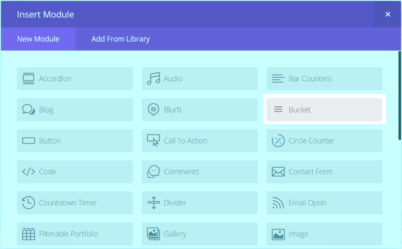
Bucket for Divi adds a new module to the Divi Builder called Bucket.
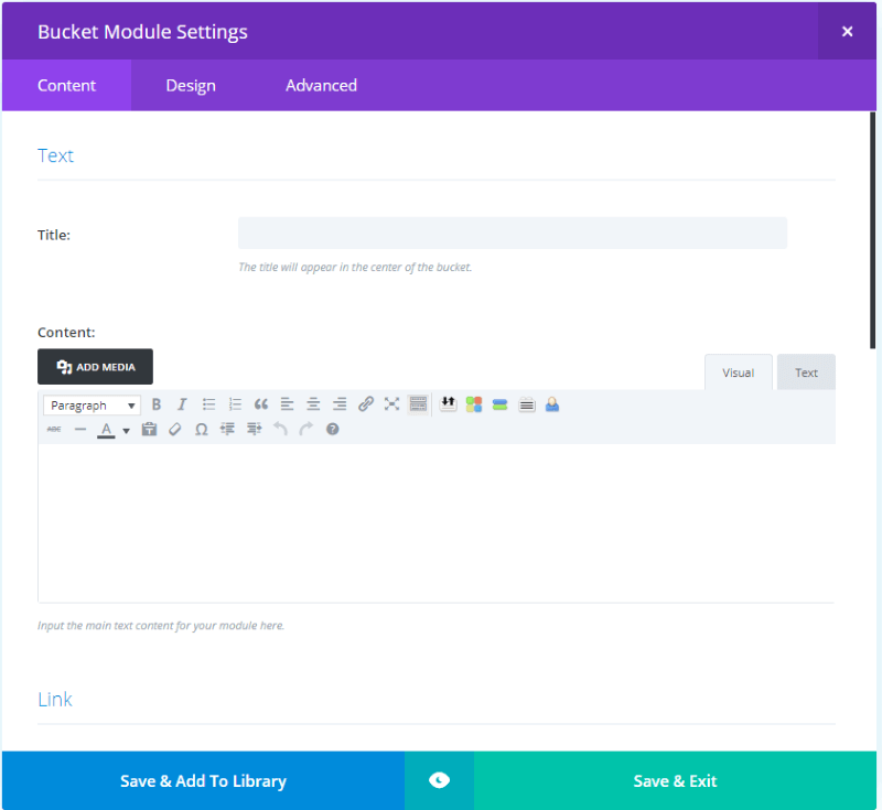
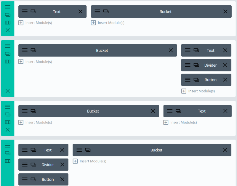
The Content tab includes settings for Text (with title and content), Link (with URL and Open options), Image, Background, and Admin Label. The Design tab includes the standard options but adds a sizing feature where you can enter the height in pixels. The Advanced tab includes all of the standard CSS fields.
For comparison:
- The Image module includes the image, link, and background features.
- The Call to Action module includes the text, link, and background features.
The only features the Bucket module doesn’t include between the two modules is the option to open the image in a lightbox and the image filters. Other than that it’s a perfect blending of the two modules.
Bucket for Divi Examples

Just to see what this module can do, I created two modules with the same content (so I can show one on hover next to one without hover), added a title, text, and an image.
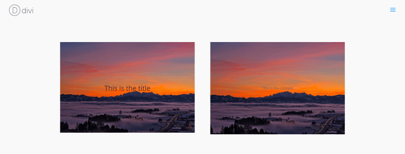
These use the default settings. The image on the left shows the title. My mouse is hovering over the image on the right, which shows the text that I wrote in the content area. The module automatically zooms on hover, which you can see in the image on the right.
I can already see a lot of possibilities here for portfolios, links to pages on the landing or homepage, galleries, product links, etc. Let’s build a few of those and see what it can do (although, instead of building the layouts myself I’m going to save some time and use Divi Cloud).
Bucket for Divi Photography Portfolio
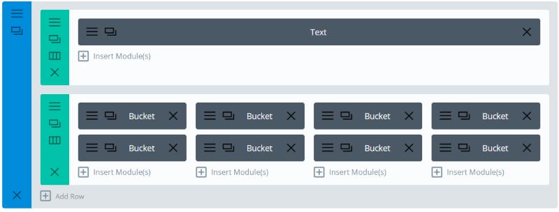
This one uses the Photography 2 layout. I’ve replaced the text modules with Bucket modules in order to create links to photo albums.

The result is clean and fits perfectly within the design. These are dark photos and blend well with the dark background which looks great with nighttime photography.
Bucket for Divi Real Estate Layout
In the Real Estate 3 layout one I replaced the home image modules with Bucket modules.

It fits nicely with the layout. I’ve made some color changes to the fonts but that’s the only change I’ve made. I’m hovering over the top image.
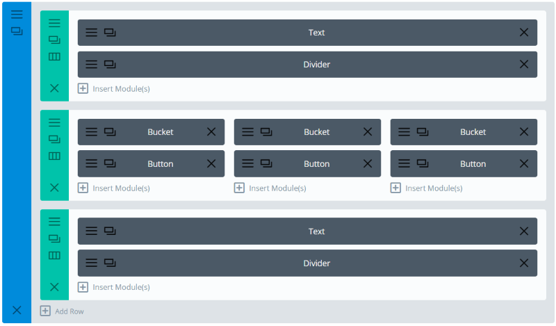
This time I replaced the blurb modules with Bucket modules. I removed the CSS and made the text light.
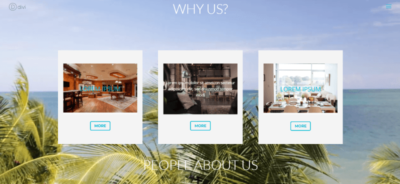
The Bucket modules work great over the video background in this layout. It’s a much different look than what you’d get with blurbs. I’ve kept the row’s background for each column and made the Bucket module’s header text match the color of the buttons.
Bucket for Divi Product Page Link

This one uses the Health Store Woo layout. For comparison, I wanted to show the original, which used image and text separately. The header text uses CSS to bring in a specific font family.

The original image and text modules look excellent. Let’s see what the Bucket module can do.

I replaced the image and two text modules (one for the header and one for the body text) on each side with Bucket modules, replacing 6 total with 2. I also added the CSS to the Advanced tab to bring in the same font family. Since I’m placing text over an image I’m using a shadow effect.

The result is a smaller element with an interactive image. This creates an elegant look but the body text isn’t immediately available.
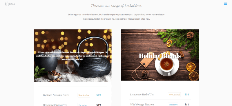
The body text is still there but now it displays on hover. Since you can make the images clickable you can have it take the reader to the product page.
Bucket for Divi Services

This is the Services section from the Coach 1 layout. The original section uses images with text under it for the title and body, and a button for the CTA. I’ll keep the text in place, but add the CTA to the image with a link.

I’ve replaced the image and button modules with a single bucket module. It looks practically identical to the original, but now instead of a button, the image is clickable. Of course, we could move the header and body text to the image if we wanted to.
Bucket for Divi Portfolio

This example uses the portfolio section from the Agency 1 layout. The layout uses two images: the first one is tall. The second actually has two images side by side over a single image, creating a multi-column layout.

Here’s a look at the original. It has one image in one module and three images in the other. I will replace each image with Bucket modules and remove the button. My layout will be similar, but different.

Here’s my version using the Bucket module. I used five modules with images of different sizes to create a multi-column layout.

Here’s the design using the five Bucket modules. I like this alternating design. You could control the heights with the setting in the Design tab if you wanted to use images of different sizes but wanted them to appear the same.

Rather than using a button I’ve added the link to each image. Now the button can take the reader to each project rather than a portfolio page. Of course, we could leave the button if we want.
Using Color Backgrounds
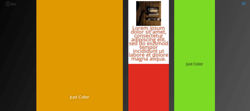
You can use color rather than images if you prefer. In order to get the blocks of color to be the size you want, you have to define the bucket height in the Design tab.
This is the same layout as the one above but I’ve removed the images and placed color with the backgrounds. Within the text area, I’ve placed my body text and an image. This text and image only shows on hover. In the image above I’m hovering over the white background.
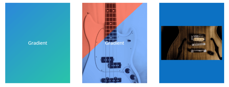
You can also use background effects such as gradients and overlays. These have color backgrounds set to a height of 400. I’m hovering over the one on the far right to reveal the image. The one in the middle is using an overlay with a gradient. With the backgrounds and overlays, you can create some interesting hover effects.
Using Bucket for Divi with Extra

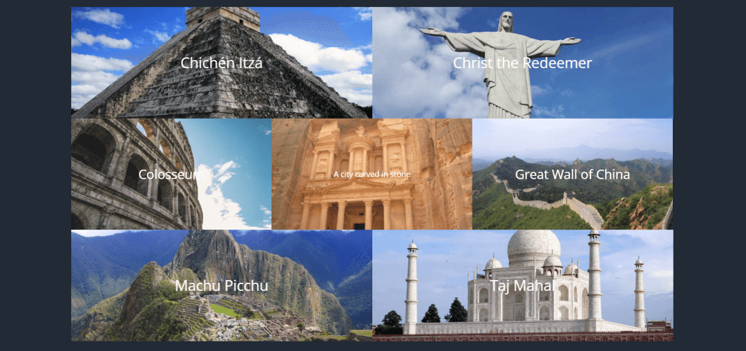
Bucket for Divi works great with Extra. Here’s the previous example with my mouse hovering over the middle image.
Ending Thoughts
I found Bucket for Divi a fun plugin to use. There are some text and image zoom animations planned for future updates, which will expand the design capabilities. It doesn’t include the filters for the image module, but of course, at this price, I wouldn’t expect a lot of extra features. The very fact of combining the two modules is well worth this price.
It’s simple to use and if you know how to use Divi then you already have to skills to use this plugin. If you’re interested in a module that combines the functionality of the Divi image and call to action modules, Bucket for Divi might be the plugin you want.
Your turn. Have you tried Bucket for Divi? Let us know what you think about it in the comments below.





A lot has changed in Divi since the last update of Bucket for Divi. I’ll have a look at the image filter options and implement them in Bucket. 🙂