

Google is making some major changes this month and a lot of websites are going to take a hit in terms of SEO. When most people think of SEO they think of content but this SEO update is all about design. Google is constantly changing and making updates to their algorithm to make sure only the best and most authoritative websites show up on the first few pages. This update will do just that across mobile devices.
Google’s biggest updates of the past are known as Panda and Penguin. The Panda update was released in 2011 with a goal of ranking high-quality sites before low-quality sites. The results affected 12% of all English searches on Google. The Penguin updates happened over three phases from 2012 to 2013 and combined they affected 4% of all Google searches – globally and on all devices. To put this into perspective there are about 3.5 billion searches on Google every day. Google’s new algorithm update on April 21 will affect more websites then both of these previous updates.
The new algorithm is going to reward mobile-friendly websites. Mobile-friendly sites will now rank higher and be more visible than websites that are not mobile-friendly. To anyone who pays attention to Google, this shouldn’t come as a surprise. Just last year Google made changes to their mobile algorithm by tagging mobile sites as mobile-friendly in the metadata.

Google makes many changes to their algorithm all the time to make sure only the best sites show up. They decided to announce this update early to help business owners prepare. They have stated that this will be one of their largest updates. It is estimated that 50% of all Google searches are done on mobile devices. If your site is not mobile-friendly, you are in danger of dropping in the search results quickly.
In an effort to clarify some of the changes coming, Google hosted a Google hangout last month that resulted in three key takeaways:
You’re Mobile-Friendly or You’re Not
Most algorithm updates aren’t simple; this one is. There’s not a little mobile-friendly or a lot mobile-friendly. There is no scale on which your site mobile-friendliness is being graded. Your website either completely works on mobile devices or it doesn’t. It’s as simple as that. If it doesn’t work on mobile, make changes immediately or be prepared to see a drop in SEO results.
Roll Out Will Happen Over a Week
The scheduled launched for the new update is April 21 but this will be one of Google’s largest and most all-encompassing updates. They are planning that the update will take about a week to fully roll out.
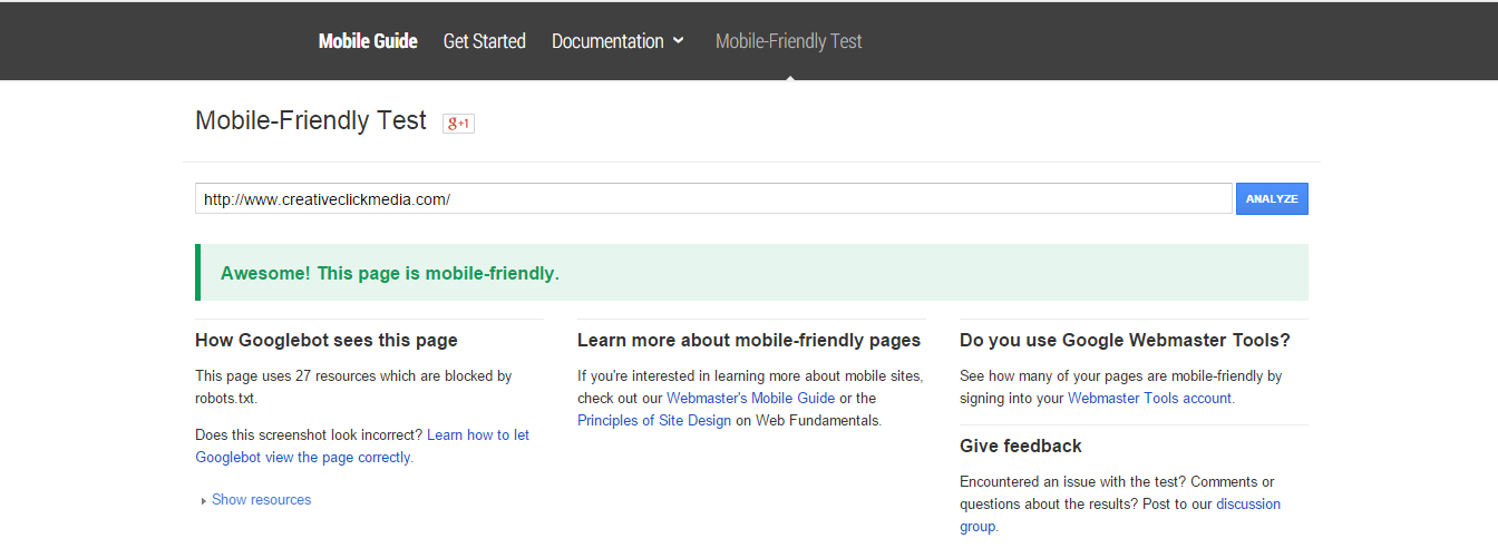
Check Your Site NOW
Google isn’t trying to hurt businesses; they’re trying to help consumers. They made the announcement in advance so business websites could prepared. Additionally, they provide free tools to check if a site or webpage is mobile-friendly. Use Google’s mobile-friendly test to check the mobility of your website. The test is very simple – you just enter your URL and Google will tell you whether or not your site is mobile-friendly. The sooner you find out, the better.
What Does this Mean for You?
As web designers and digital marketers, we are always thinking about optimum site performance but now it’s time to think about responsiveness. Over the next few years, mobile is expected to dominate desktop search so it’s important to keep mobile design in mind for all future website.
The good news? For designers using the Divi theme, you’re already mobile-friendly! The Divi theme easily responds to mobile devices perfectly. If you’re a Divi enthusiast, make sure to keep that in mind and use it in your sales pitch to reel in new clients.


helpful article!!! thanks
After writing a missive to my mailing list that went a lot like this, I read some fine print. The algorithm doesn’t apply on searches done from desktops, or even tablets – only phones. And it ranks on a page-by-page basis – although who has SOME pages on their site that are mobile-ready and others that aren’t?
Not that I don’t want everyone lacking a responsive site to come knocking on my door, but felt that explanation gave them some intelligence about the issue and not just the doomsday part. 😉
Thanks for the article. A site I developed and manage gets about 10k page views/wk and over 80% are from mobile devices. I’m glad it’s Divi based.
Just an suggestion… You may want to make your links stand out a bit more. I’m seeing them as black on gray text and had to scroll up and down several times to find the link for the Google mobile friendly test site.
is it wrong that I just tested my competitors websites and smiled a bit when I saw 4 out of 5 weren’t mobile friendly? =)
I don’t see anything wrong with it 🙂