In this article, I want to talk about trends in copywriting. Take it as an outlook on what will be important in the years to come. And when you look back a few years from now, you can safely say that you read about it first on Elegant Marketplace. 😀
Okay, I am not reinventing the wheel here, but I did all the hard work for you. I spent endless hours reading about the latest trends. I took pages and pages of notes at the WordCamp Europe in Berlin this June. And I spoke to leading thinkers in the online marketing world. Here’s your inside scoop. If you read it all the way to the end, you will agree that writing great copy is only the tip of the iceberg. So much more goes into a future-proof content strategy.
Content that is hard to read is bad content
There are many reasons why you want to make sure that your content is easily digestible. Let me list a few, before I dive a little deeper.
- Crawlability
- Bounce rates
- SEO
- Conversion rates
- Accessibility
- Sustainability
- Credibility
These are in no particular order and depending on the project, their priority might change.
Crawlability of your copy and content
As for crawlability, I trust the SEO experts at Yoast. In one of their latest magazines, they dedicated a multi-page article to the topic. Aside from writing copy for SEO, we have to keep in mind what comes before that: your website needs to be crawled to be indexed. No-brainer right there. Many factors go into the Googlebots’ decision to crawl your website. Your content structure included, as well as the readability of your copy. This goes beyond the actual content that you see on the frontend. Think, for example, images (even with words) that aren’t properly marked with alt text and descriptions.
Hence, make sure that any and all content on your website is crawlable (1). This not only applies to your copy. The best written copy won’t deliver the results you are aiming for if your robots.txt file or header files are sabotaging your efforts. If you’d like to learn more about that, I’ve included a link in the footnotes.
Bounce rates and bouncy castles have nothing in common
Bounce rates show how many visitors navigate away from your website after visiting a page and how fast they do it. Marketeers love to make us believe that placing links (internal and external) in our copy is a good thing. They also claim that CTAs (Calls to Action) are the salt that gets us conversions. While I agree that links and CTAs are important, you don’t want to encourage visitors to leave your page or blog post before they’ve finished reading it. In his talk at WordCamp Europe (2), Fernando Tellado even said that a CTA mid-content shows the author’s lack of confidence in their own writing.
Again, many factors go into your bounce rate. But two things you should make use of very diligently are links in your copy and CTAs. If possible, place them toward the end of your content as to not drive your visitors away.
Writing for the sake of SEO is always bad
It’s 2019 and we all know that we shouldn’t stuff our copy with keywords or write what we think would please an algorithm. Spoiler alert! Nothing pleases the algorithm more than what actually pleases the user. However, there are many great articles out there on SEO-friendly copywriting, I’ll forgo the urge to write about that here. Just this much: Don’t write for SEO. Write for your human visitors and for the internet. The latter is different than writing for SEO. Maybe I will write about that in a future post.
Buy! Download! Join!
Simple to read content converts better. When a potential customer comes to your site and understands your message, they are more likely to buy. Or sign up. Or download. Your conversion rate, like everything else, depends on a lot of different factors. But first, the visitor has to understand you.
There’s scientific evidence (3) that we have only a limited amount of “brain muscle” for reading and understanding complex text. Making your copy easy to process makes it easier for visitors to simultaneously envision themselves fulfilling your CTA. In other words, do not make your visitors think about your message. Give them the free headspace to see themselves doing what it is you want them to do.
Expand your reach by offering accessible content
Did you know that 1 of 5 users require some kind of accommodation to access content on the internet? If you don’t pay attention to accessibility you are losing out on potentially 20% of traffic and all that it comes with it. Accessibility (4) is not just about the design of a website, the colors, the fonts, or the site’s functionalities. The copy itself and all the other content has to be accessible as well. Simple language and content structure are the soft key – next to technical aspects – to creating accessible websites.
Sustainable web design for the love of a liveable future
My personal focus these days lies on sustainability. That’s right. Good copy that is easy to read and checks all the other boxes is good for the environment. The exiting part? Website sustainability is also great for SEO.
Simple and well structured copy and content equals a lower CO2 footprint for your website: easy to pull up, easy to understand, and the visitor is more likely to get what they are looking for. Also, sustainable web design (5) and content makes for fast websites and great user interfaces. If you are interested in learning more about sustainable web design, follow Jack Lenox. He knows all about it.
Simplify your copy and content structure to get the credit you deserve
Simplified copy is also great for your credibility. How? As Marieke van de Rakt (CEO, Yoast) said in her WCEU talk (6), “You will never hear someone complain when you explain complex issues in simple words.” Quite the contrary. The more people understand what you are saying and the more easily digestible your content, the more people you can win over with your words. This affects your credibility directly.
So what’s with the trends?

See browser icon on my new intercom (no internet available yet in the house, would have loved to show you the EMP website).
Ah, but… You’ve read this far and I have not really talked about trends. Thing is, as so many of you out there, I just know the elephant in the room: mobile devices. We should be designing our websites and creating our content for mobile devices. Touch screens, too.
But I would take it even further. Just today I stopped by our new house that will be ready to move in (hopefully) by the end of next week. As I was admiring all the empty space, the intercom caught my attention. And it hit me: Not only do we have to design our websites and create our copy for mobile devices, we also have to keep smart devices in mind. Think televisions, smart watches, refrigerators with built in tablets, and even intercoms.
Therefore, content needs to be simplified, easy to navigate, readable, easy on the kb per page load. Everything I mentioned above plays into the very trends we are facing in the decade to come. And beyond, of course!
I’d also consider it a trend that an increasing number of people are accessing foreign-language websites with the help of online translation programs. And again: simple text and a clear structure will make it easier for online translation programs to grasp the true meaning of your content and hence deliver a better, albeit not perfect, translation.
Why do I mention this? For one, globalization is our reality today and not just a trend. On the other hand, I am also a certified translator. Don’t get me wrong, I am not saying it is a good idea to have your content translated by machines. What I am saying is that with the technology available to users, you never know what their first language might be and they could run your site through an online translation program. The simpler a sentence is structured in the source language, the more understandable the machine’s attempt at a translation.
Conclusion: Simplicity can be hard to achieve, but it is worth it!
Given all the basics we read about every day – mobile-first development, speedy hosting, clean code, compelling copy, etc. – simplifiying your copy and content structure is a topic that could easily produce 10s of blog articles, perhaps even a book. Here, I only brushed those points that are most important to me.
I am convinced that web designers, copywriters and graphic designers should work hand in hand. It can help them and their clients produce and publish better content. Let me know in the comments what you focus on when writing content. What advice do you give your clients for their copy and content? And are you seeing any trends in copywriting that should be included here?
Helpful resources
- Userway is a plugin that helps with accessibility
- Hemingway and Grammarly help users to write better copy
- Ecograder can tell you how green your website is
- Website Copywriting 101 (my brand new course on copywriting for websites)
- Readable is an online tool that helps you check the readability of your pages and posts (by URL)
Featured: WP Feedback
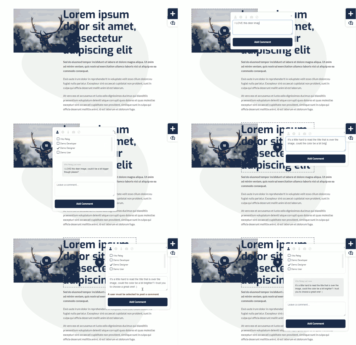
Once the copy is done for your client – they may want to feedback or give extra comments – we have seen no better way to do this than WP FEEDBACK – its an astounding plugin that sits right in the WordPress website you are working on – Soon to be featured on Elegant Marketplace – you can get it today and see what this fantastic plugin can do to help you get content feedback, amendments and how it can also help you maintain your clients websites, easier, faster and more cost effectively than ever before. Go take a look at WP FEEDBACK
Footnotes
(1) Yoast on Crawlability
(2) Fernando Tollado at WCEU2019
(3) How the brain decodes sentences | Brain turns words into complex thoughts like a computer
(4) Introduction to web accessibility
(5) Sustainable web design
(6) Marieke van de Rakt at WCEU2019


Thanks for including all the resources and footnotes! This is all super helpful.