Divi has had a lot of updates recently that have added lots of new features or improved on existing features. Not only Divi, but Extra, Bloom, and even the Elegant Theme’s support section has seen significant improvements in the past month. In this article we’ll take a look at those updates and see how they add value to the already powerful Divi framework.
Bloom 1.2
Code Improvements
The previous editions used multiple third party API wrappers to connect to the email providers. These wrappers were not made for WordPress which made development confusing and complicated when they wanted to add more providers. It was getting bloated and more difficult to deal with.
They’ve re-written the API wrappers from scratch to take advantage of the WordPress native functions. Bloom 1.2 has a new API system that increases hosting compatibility and cleaner code that’s leaner and easier to maintain. It’s faster than that previous version of Bloom.
The API management system is now part of ET’s core framework, which improves the interfacing and gives Divi the ability to connect to all of the email providers using the Email Optin module. This increases compatibility throughout the Elegant Themes product-line and simplifies updates on the coding side.
New Email Providers
Three mail providers have been added:
- ConvertKit
- Mailer Lite
- Mailster
This brings support to 19 email providers, giving you even more options. The more the better.
Success Redirection
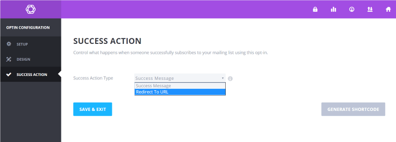
Success redirection is one of the most important updates for Bloom. Now you can choose to send your subscribers to a custom URL after they subscribe to your newsletter. This is a great way to provide a success message with access to a free offer such as a download. Previously the redirection had to be handled through the email provider, which could be limited and kept many developers from using Bloom.
Wireframe View
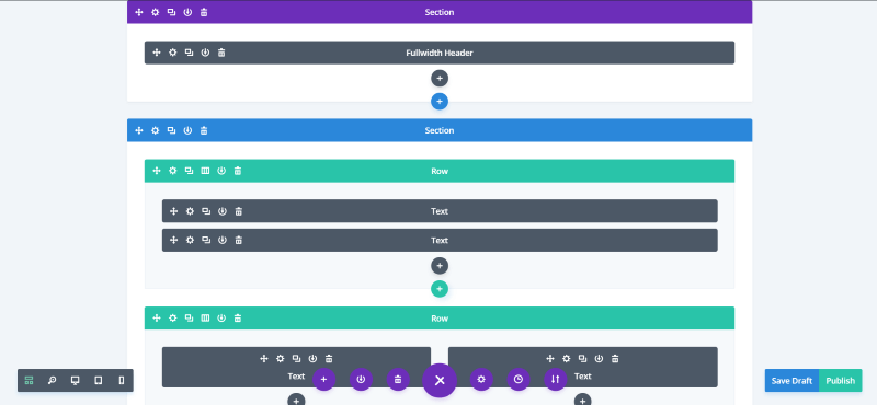
Wireframe View allows you to use block-based building in the Visual Builder. It makes it easy to move modules, rows, and sections by drag-and-drop. You can switch between the different views instantly. The Wireframe View is demonstrated in the above image using the Music layout from Divi Cloud.
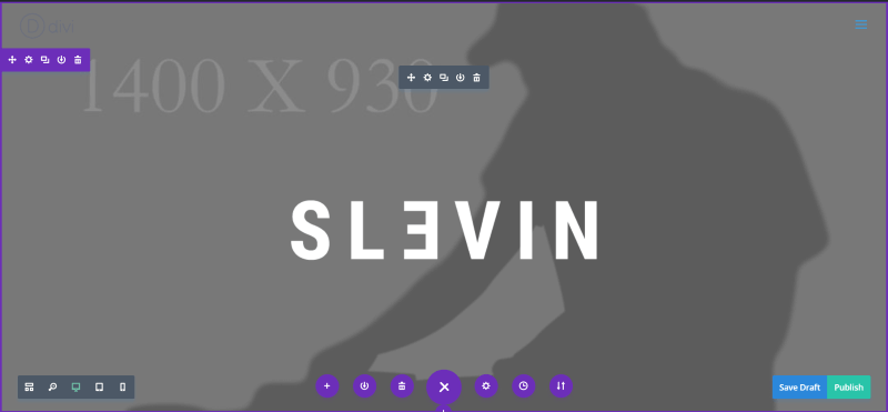
This is the same page using the standard Visual Builder view. This is especially helpful for anyone that likes to use the standard Divi Builder to lay out their pages. Pages can now be laid out the same way without having to go to the backend.
This makes the Divi system better suited for building no matter what style of builder you like to use. It’s also great for seeing the page for mobile devices without having to switch from the backend to the frontend and then back again. The Wireframe View greatly improves productivity.
Options Organization
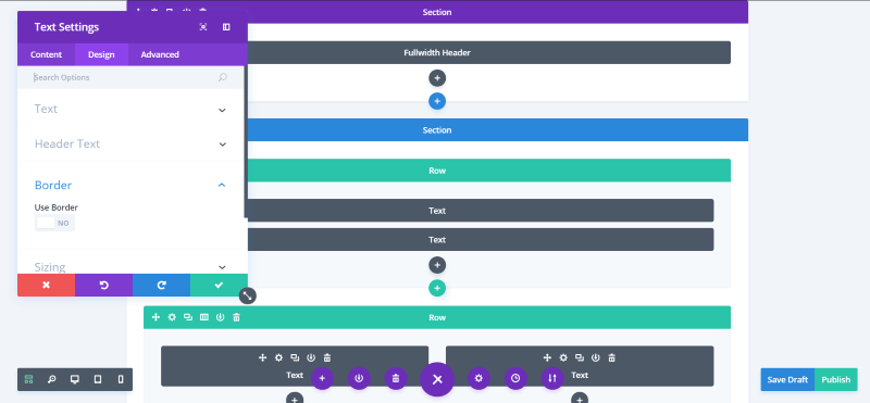
Options for the Divi modules are now better organized. The three tabs have been renamed (Content, Design, and Advanced) and the options have been moved to the most appropriate tab so the options within them make more sense. The options have been grouped within a hierarchy that keeps them more organized and easier to find. This organization allows for easier expansion while reducing clutter at the same time.
The Visual Builder has an added feature that closes the groups within toggles, allowing you to open the group you want to see the settings for. This keeps the window smaller and keeps you from having to scroll excessively to find the group you want.
Visual Builder Search Options
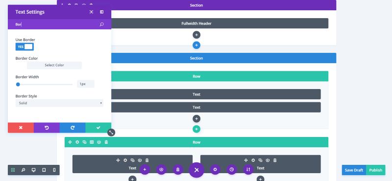
All of a module’s options within the Visual Builder are now searchable. The results appear instantly and you can use the options within the search results. Just a few letters is all you’ll need to type for most settings, as you can see in the example above.
New Selective Sync System
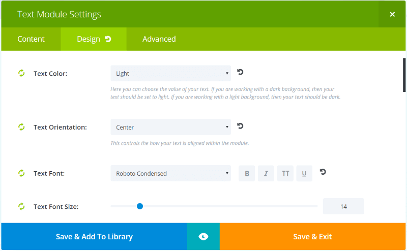
Selective Sync allows you to sync specific settings for your global modules. For example, you could style a text module and then update every page that uses that module while at the same time un-syncing the text itself so each page would have the updated settings but retain their own text. This is great for those times you want to customize the module but not change the content.
The old Selective Sync system allowed you to select the tabs you wanted to sync, but you couldn’t select specific items within those tabs. The new system allows you to sync every setting individually, giving you complete control over what will or will not sync for your global modules.
Documentation System
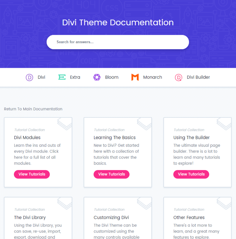
Tutorials in the Elegant Themes membership area have been updated with the latest settings and screenshots, and are now placed into a single location. This includes tutorials for Divi, Extra, Bloom, Monarch, and the Divi Builder plugin. This means you only have to look in a single location to find documentation for everything. Videos are also being added. Documentation is now searchable. The search includes the documentation, support forums, and blog, and each result is relevant to your search terms.
Background Options
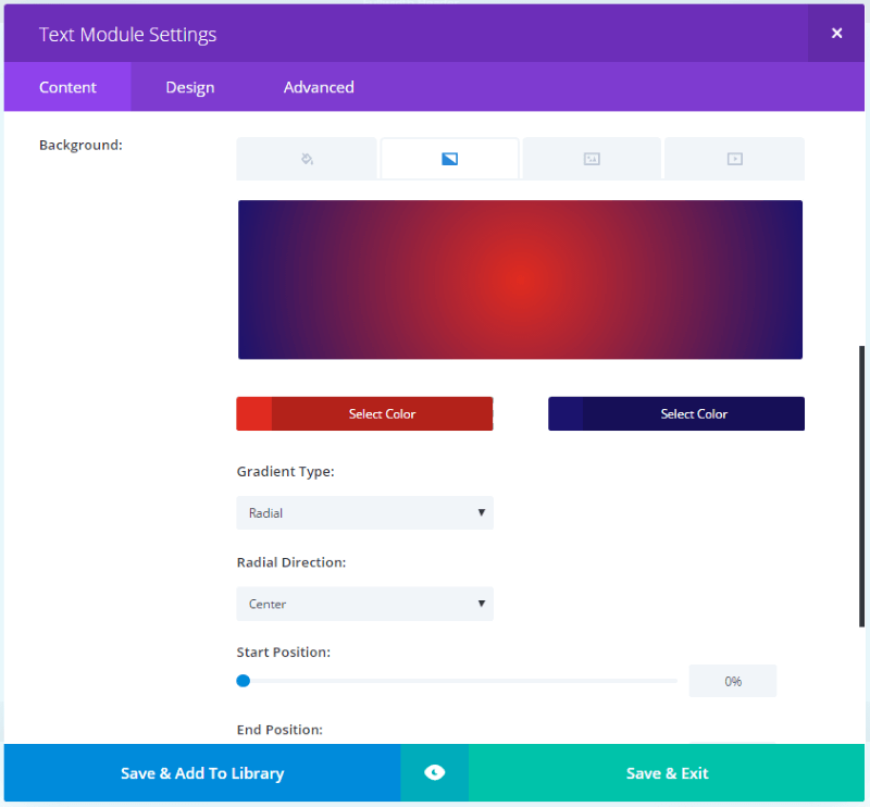
The background options now have a new interface that organizes the features into a tabbed system that’s easy to use. It gives you a preview of the styles you’ve enabled and lets you see how they work together. This is a second level of organization within the Content tab and makes the options much easier to find and use.
Gradient Backgrounds
Gradient Backgrounds are probably my favorite new feature. You can easily create gradients by selecting two colors, the gradient type, radial direction, and start and end positions. That’s all there is to it. It automatically gives you a preview of your custom gradient. You can see this demonstrated in the image above.
New Image Controls
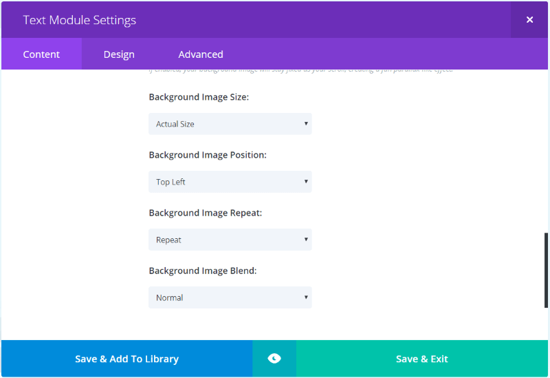
The Background Image tab includes a few new options: size, position, repeat, and blend. Simply select your choices from the dropdown boxes.
Background Image Blend
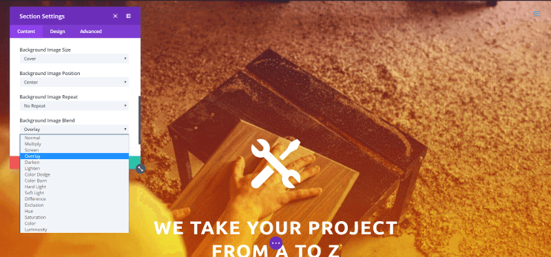
This is a new CSS mode that lets you add a background and then select a blend mode. It works with solid backgrounds as well as gradients. I love how this works with gradients. In this example I’ve created a gradient and then chose Overlay from the Background Image Blend dropdown box. This example uses the Interior 1 layout from Divi Cloud.
Improved Contact Form Module
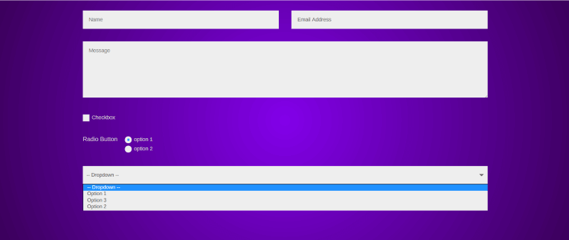
The Divi Builder Contact Form module now has lots of advanced features making it more useful and replacing many of the popular form plugins.
New Field Input Types
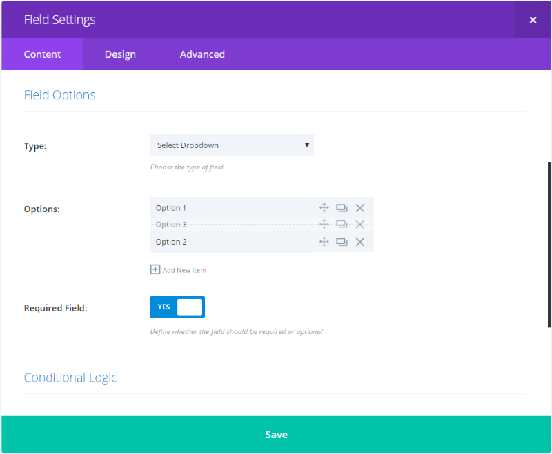
The form now has several new field types including checkboxes, dropdowns, and radio buttons. This is a great way to add required fields, provide easy ways for users to make selections without having to type everything in themselves, and to limit their choices. These help reduce mistakes and make the forms easier for the user, which will also get more users to fill them out.
The Radio Buttons and Dropdown boxes have a sub-item system so you can create the choices, label them, and drag-and-drop them to rearrange them in your preferred order (as seen in the image above).
Field Validation
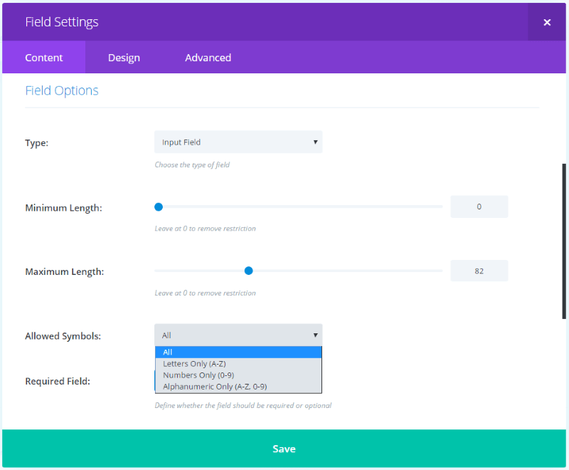
Fields now have validation rules so you can control the format of the information that’s submitted to the field. Choose the field type, set the minimum and maximum length, choose the types of symbols that are allowed, and set whether or not the field is required. This helps reduce errors and gives the user a little help in determining the type of data that goes into the field.
Conditional Logic
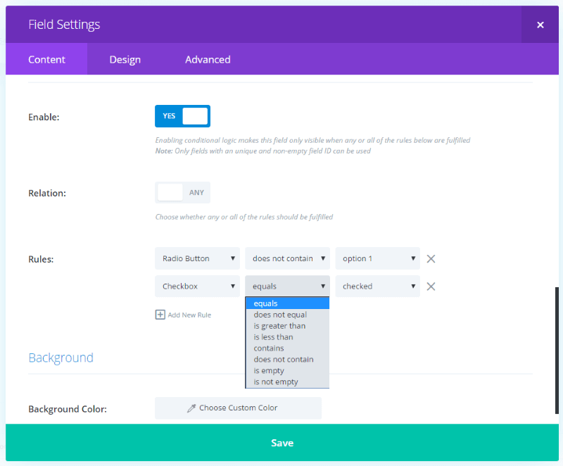
Conditional Logic is my favorite of the new features for the Contact Form module. You can create your own conditions and add as many conditions as you want for each field. This allows you to create dynamic forms that adapt to your visitor’s choices, such as hide or show fields based on options that your visitors choose.
The rule types and result choices change depending on the type of field you select the condition for. There are 8 rule types and you can mix and match the logic to create any number of conditions. The conditional logic interface is easy to use and creating the conditions is as simple as it gets.
Final Thoughts
Elegant Themes have added a lot of excellent features to Divi in their recent updates. They’re highly significant and make improvement with UI/UX with the new options layouts, new features including a Wireframe View, Gradients, and a new Form module with conditional logic, as well as improvement under the hood to make development faster and improve performance.
They’ve taken an amazing framework and added even more value while making it easier to use and increasing design and development productivity at the same time. If you haven’t used Divi before, now’s a great time to start.
You can get Divi as part of the Elegant Themes membership which is $89 per year or $249 for lifetime access.
We’d like to hear from you. What’s your favorite of the recent updates? Let us know in the comments below.


