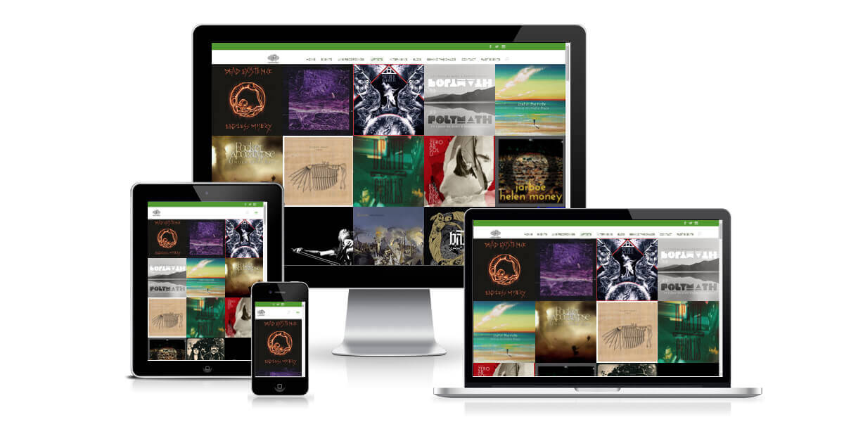
The full-width portfolio section is one of my favourite Divi sections – combined with the ability to use page-builder in projects, it gives you a wealth of ways to display and categorise information on your site. Which is all well and good if you consistently have landscape images to illustrate your projects, but what if you want to customise the display? I worked with a promoter who wanted to showcase the bands he’d put on, where the most consistent image size is square, for album artwork, so with a bit of help from the support team at Elegant Themes, I managed to come up with a work-around to make the full-width portfolio display square images. You can see it in action on the Chaos Theory Music website.
Note: You should be using a child theme for this tutorial, as it requires changes to theme files which will be otherwise lost when updating to newer versions of Divi. Elegant Themes wrote a great blog post about setting up child themes, which you can read here.
STEP 1:
In your child theme folder:
Create a folder called js
Copy across the custom.js file from Theme/Divi/js into this folder
In custom.js, search for
portfolio_item_height = portfolio_item_width * .75;
Change this to
portfolio_item_height = portfolio_item_width;
(i.e. delete * .75)
STEP 2:
In your child theme folder:
Create a colder called epanel
Copy across the post_thumbnails_divi.php file from Theme/Divi/epanel into this folder
Change the value for
et-pb-portfolio-image
to
400x400
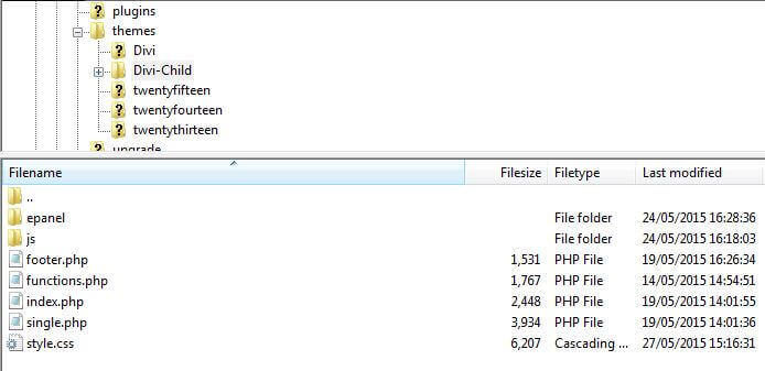
Your child theme folder should look something like this (it won’t necessarily have all those files in, but it should have the folders):

STEP 3:
Add the following to your child theme style.css
.et_pb_fullwidth_portfolio .et_pb_portfolio_image {
height: 381px !important;
}

.et_pb_fullwidth_portfolio .et_pb_portfolio_item {
height: 381px !important;
}
STEP 4:
You’ve got two options here.
 To make the title appear above the plus sign when you hover-over a portfolio item, add this code to your child theme’s style.css:
.et_pb_fullwidth_portfolio .et_pb_portfolio_image .et_overlay:before {
top: 55% !important;
}
 If you’d prefer the plus sign to appear above the title, add this code instead:
.et_pb_fullwidth_portfolio .et_pb_portfolio_image h3 {
margin-top: 40%;
}

.et_pb_fullwidth_portfolio .et_pb_portfolio_image:hover h3 {
margin-top: 50%;
}
STEP 5:
Regenerate Thumbnails
And you’re done! This should give you a square container for your full-width portfolio images and display a square crop of the featured image you’re using for the project pages. Enjoy! See the site live: Chaos Theory Music


Has anybody managed to make this work for more recent DIVI templates?
So this does not work with DIVI 2.7x ?
Can you please update !
Hi Hannah, tried this running Divi 2.7.3
Although the js (frontend-builder-scripts.js) and php file (post_thumbnails_divi.php) has changed places, I managed to do what you said. I now have square images!! Brilliant.
Although they do not scale correctly like they do on https://chaostheorymusic.co.uk/bands/. The annoyingly jump and overlap
I am such a beginner, and this just seems impossible to sort out.
Any help would be much appreciated, my site is getindesign.co.uk
Hannah, can I check please, did you update the child theme for https://chaostheorymusic.co.uk/bands/ when you updated to divi 2.6?
Reason is I had the square image portfolio grid working beautifully before the update; after the update, the grid was fine, but it messed up the JS so no animations worked.
Do you have any tips for how to do this for the latest DIVI? many thanks
Hi all,
The js file is frontend-builder-scripts.js and can be found in “\includes\builder\scripts\”
Also the php file is now in the theme root directory.
However, I tried this with Divi 2.6.x and unfortunately it doesn’t work.
An update on this article would be great!
Hello Hannah – I wondered if you had been able to check this for the current Divi – like Justin above, I got stuck on finding the portfolio height spec in the custom.js file
Many thanks, its a great cusomisation of the gallery, hope I can get it to work
Elizabeth
Hi Justin,
This tutorial was actually written for Divi 2.3. I did test it with 2.4, but I haven’t tested it on a 2.5 site yet. I’ll have a look when I get chance and see if I can work out where the code is now – if I find it I’ll let you know!
Cheers
Hannah
Is this article still correct for Divi 2.5.3? I’m trying it now but my custom.js file doesn’t have a line in there with:
so I’m not sure what to do. Does Divi 2.5 have an easier way to create square thumbnails?
ALRIGHT!!! So…
——————
function custom_gallery_height() {
$height = ‘on’ === $fullwidth ? 9999 : 400;
}
add_filter(‘et_pb_gallery_image_height’, ‘custom_gallery_height’);
——————
You may need to set wordpress thumbnails to 400×400 for this to make sense/have the thumbs created. I´m not sure. (I did it anyway)
(That´s done in Settings>Media, if anyone´s wondering)
Hi Hannah!
Thank you very much for the tip.
Do you know how could I get this to also apply to the grid gallery module?
I´m really having trouble trying to achieve this same thing you describe but regarding the grid gallery module.
It seems that the theme wants to use the -400×250 thumbs no matter what.
Thank you very much in advance.
Hi Graeme,
Thanks for your comment – I did actually try to record a video tutorial for this but my microphone was broken!
Can you give me a bit more information about how you created the custom.js file? Did you do it in WordPress or did you do it via FTP?
What you should be doing is copying the existing custom.js file from the Divi parent them into your child theme folder. If you’re using an FTP client like Filezilla, you can open the file that way, or if you’re doing it through WordPress you should be able to select the new custom. js file if you go into the “Editor” option in the “Appearances” menu. If you’re doing it through your computer, you should be able to open the file in a program like notepad – just remember to save it back as a .js file rather than as a text file when you’re done.
Then you just do a search for portfolio_item_height = portfolio_item_width * .75; in the custom.js file you’ve put in your child theme to find the code.
Hope this is helpful – if you’ve got any further questions, let me know!
Hi Thanks for this tutorial on making portfolio square images. I managed to save a js file into the dive child theme folder but then got lost from there? How and where do you open up the file to change portfolio settings, maybe a more detailed picture of each stage or a video tutorial might be more helpful. Thanks Grae